I had a Nike+ Armband but the display malfunctioned because of a manufacturing defect. I took it to the Nike Store and they gladly took it back and offered to replace it. Unfortunately, it couldn't be replaced until the new version came out. So I waited. And waited. And waited. That is where the iPhone came in.
When I got my iPhone I was disappointed that Nike didn't have an app. It was also frustrating that the Touch and Nano iPods integrated with the Nike+ system. I used iMapMyRun and searched for a good run tracking app. Runkeeper, with it's free version looked promising. I used it for a week and quickly bought the pro version. I've never looked back.
Not only is Runkeeper a great app, it's developers reach out to users to listen to ideas and troubleshoot problems. They also iterate at a feverish pace. New features added in the last few releases have made Runkeeper a robust app with well thought out user experience. The visual design has been refined as well and looks as slick as it's features. That feature list hasn't grown too much either. This is an app designed by people who use it. The Runkeeper brand and the people who are behind it are just as cool as the app itself.
But the app is just a part of the story. The data that the app presents has literally changed my life. Seriously. Seeing the miles rack up, seeing my pace go down, has revolutionized my runs. They aren't just something I have to do, but something that is an integral part of my life. I run because I love it. And I can see the result of that love on the pages of Runkeeper.com. I can also see my friends runs and friendly competition inspires improvement.
For a long time I wondered why Nike didn't just buy Runkeeper. Even more puzzling, I wondered why they didn't have their own offering. I feel like Nike, and other major running brands, just didn't think people would ever want to run with their iPhones. Talk to runners and some will tell you that they want as little resistance and weight as possible. In the end, iPhones don't way that much and you really just get used to it. Well, now Nike has introduced their gps driven running app. I can only imagine the other heavy hitters in the running category will follow suit.
I love Runkeeper CEO Jason Jacobs' response to nike's entry. He definitely has a great attitude and perspective on the business. But if he was hoping Nike would show up with a half-assed attempt, he would be kidding himself. Nike brought their A game. It's evident that runners made this app. Sure, it's overuse of wetfloor might make you think it's all flash (pun intended) but it is a well thought out app that is a serious competitor.
I'm a User Experience designer with a specialty for visual design. I look at things holistically. I'm also someone who is passionate about running and uses data for motivation. I looked at the apps from the perspective of interaction, visual design, and brand.
Interaction
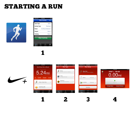 |
| 1 Step vs. 4 Steps |
Runkeeper includes a bar chart display in addition to the map and run data. However, I discovered I didn't miss it and couldn't really think of a reason for it while running.

My favorite parts of the Nikeplus UX:
- Lock mode for in-run display — Simple, clean, and maybe it increases battery life?
- Display preferences — Nikeplus allows you to set the orientation of the display. I always have to flip the display so in Runkeeper because I wear my armband on the right.
- Powersong and Music — This has always been a miss for RK. The music settings don't make sense and it's easier just to use the iPod app.
- Comments and tags for runs — The little icons are easy to use, especially when sweating profusely. I do miss Runkeeper's publish to Facebook feature though.
- Calibrate my run — Sometimes GPS gets it wrong. This is an easy way to correct without editing a map.
- Improve my run — After a run, you can set a goal for besting the run you just did by speed, length of time, or distance. This would be an easy add for Runkeepers amazing training settings.
- Miles Tally — At the end of my second run, it was extremely gratifying to see the miles tick up to the total. A simple thing, but a great motivator.
My Favorite Parts of the Runkeeper UX
- On Demand Updates — In addition to voice cues at miles or timed intervals, RK will update you with a simple touch of the screen. This is great for in-run updates when you're not paying attention at the intervals.
- Interval Training — Nikeplus HAS to add this. It can take a run of the mill run and turn it in to an ass kicker.
- In-Run Photos — This sounds like gingerbread but when you see something cool, it is nice to add it to your run.
- The site — Fast and data centered. Still needs a stronger community aspect, but speed and usability go a long way.
Design
This is a tricky one. iPhone design tends to gravitate to the super-glossy and both apps employ a similar level of gloss. Nike's feels lighter and more clean, highlighting the important data. The level of detail on the icons and menus really makes it a polished app.
When designing my own iPhone apps I usually try and stick with the default iOS UI elements. This leverages the user experience iPhone users are accustomed to and also ensures that you can take advantage of improvements easily later on. Runkeeper uses for the most part, styled iOS UI elements that gives it a familiar look. Nike uses their own style on everything. This can go terribly wrong, but in this case it all works and strengthens the branded experience. Most of the elements are an improvement over their Apple counterparts.
One thing that needs to go is the wet floor effect. I have nothing against it and have used it (probably too much) myself many times. It is one of the most long lived trends but it is on it's way out. This may have something to do with a larger point. The Nikeplus site.
The vibrant community on the Nikeplus site is one of the things that gives it a huge edge over it's competitors. Yet, the site itself is kind of buggy (only works in Chrome or Firefox for me and I still haven't been able to access any of the coaching), slow (mostly because of Flash), and sometimes is hard to find what you want. Mainly it's buggy. If I was on the project, I would have insisted the site get a major overhaul in time for the launch of the app. Complete with HTML5, CSS, and Web Standards with NO FLASH. iPhone and iPad compatible.*
*Weird: the Nikeplus mobile style is actually REALLY solid. Much better than the standard version.
Meanwhile, Runkeeper.com excels at navigating, data presentation, and editing runs but falls short on the community aspect. I love my street team but the challenges, sharing, and goals on the Nikeplus site seem more fleshed out and active.

Brand
Nike's brand is it's key to success. But I'm not talking about "Just Do It", the swoosh, or Michael Jordan. I'm talking about the community of diehard Nike customers out there that are on the Nikeplus site and using this app. The tools and gear Nike makes are just the tip of the spear. They are the things we buy but what we really buy in to is the attitude. And it goes way beyond "Just Do It".
When I open the Nikeplus GPS app it says right at the top, "Give Every Run a Boost." I can press a button and play my Power Song (OK Go White Knuckles). I get encouraging messages from (what I am guessing are) famous runners and that dude from Talladega Nights. With Nikeplus, I get the collective inspiration of the Nikeplus community. And that is a powerful thing.*
*Again... slow and buggy site.
Runkeeper has a long way to go to reach Nike status but they are off to a good start. The amount of innovation they put in to every release is incredible. The response I get from tweets and email (although none lately *ahem*) let me know they are listening (again... *ahem*).
Final Thoughts
I have no plans to switch to Nikeplus, especially since it is so easy to run with both apps. However, I am going to import the rest of my runs from Runkeeper (can someone make a better app for this, plz... I'm using this) and I am going to keep running with it.
I think I like Nikeplus better than Runkeeper. From the voice of the audio cues to the locked mode for the display, it's a well thought out experience. I like the Runkeeper site better for data but I like the community on Nikeplus more.
The key will be the next six months. Nikeplus.com has some serious issues. They need to be fixed. I'm also curious to see what is next. It is easy to go down a list of competitor features and check them off. I hope to see apps from Saucony, Asics, New Balance, Adidas, and other major running brands. The competition will only make the apps, including Runkeeper, that much better.
For Runkeeper, I would say keep doing what you're doing. You rock. I love the attitude. If it were me, I would ditch the Android version, EOL the Free version, and lower my price to compete. I would also focus solely on running and biking. It sounds like that is where the passion lies and focus is important now. But that's not why I wrote this post.
I wrote this post because I am passionate about running with data. It has changed my life.
