I'm sure I my constant ranting about Adobe's new Creative Suite 5 release is getting old. Both my twitter followers and surrounding co-workers must be tired of hearing about the latest UX faux pas from Adobe every 5 minutes.
But here's the thing, it's really infuriating. For better or worse, my job requires me to work with Adobe's line of products. On a daily basis, I work in Photoshop, Illustrator, Fireworks, and Flash. I'm a User Experience designer, Illustrator, dabbler in ActionScript, and I actually love their products.
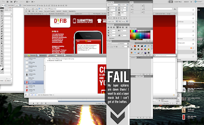
Because I am a User Experience Designer, I really love the details. All the big-splash, super-doo-wah, features don't mean anything if a user gets hung up on the login screen or a settings dialog. When I hear about content-aware fill or some 3D motion tool and then the panels in Photoshop extend beyond the borders of my display and I can't apply a layer mask, I get pissed.
My twitter antics have got the attention of @Adobe_Care and they asked me to elaborate on the issues I'm having. I love it when twitter allows big companies to connect with their users but I thought it would be a shame to take the discussion to a place where the whole internet couldn't see it. With that in mind, I'll try to list my top gripes with the new CS5. I use Photoshop most of the time so the feedback is centered around it. I've used Fireworks and Illustrator as well but have only found more speed and stability with them.
I'm also most frustrated with Photoshop because it was such a joy to use before the upgrade. It was like a classic sports car, polished and tuned. Now some of the most basic functions are broken. The engine is falling flat at over 4500 RPM and the door handle just fell off in my hands.
I also acknowledge that I am treading on "
Demon Customer" territory. I make
apps too and I know full well that sometimes it is better to ignore vocal users like me who want very specific things. However, I don't think I am "there" yet. Most of the things I have issues with are basic functionality that wasn't even a part of the new release. This is stuff that is simple, frequently used, and because of that has a huge impact on the user experience.
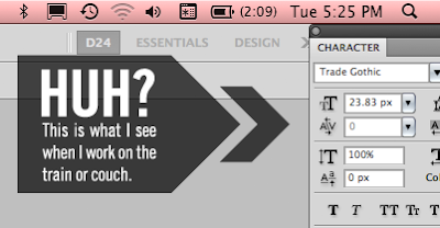
- Panels — I have a MacBook Pro and one of my favorite features of CS4 was that it "knew" when I was connected to my 24 inch display and when I was sitting on my couch watching lost and rocking some comps. Somewhere between CS4 and 5 Photoshop lost this ability. Now, after an evening of working on the couch with only the MacBook display panels flow beyond the boundary of my display.


In order to access something like the "add layer mask" button, I have to 1. Detach the panel from the panel group; 2. resize it to fit on the screen; 3. Re-attach it. Oh, and by the way, I have to do the same thing when I go back to working on the couch. Panels don't extend beyond the screen, but they appear indented from the right for some reason. Even after moving the panels back to the edge of the display, I had to do it again after closing the MacBook and opening it again later.
- Speed — I'm running a 3.06 MacBook Pro with a 7200RPM drive and 4 gigs of RAM. I was excited to hear that CS5 would finally bring Adobe in to the 64-bit world. Even working with really basic files, I encounter slowness with rendering text and brushes. Transforming shapes is chunky as well. This video I made shows an example of typing lag.
- Right-Clicking — This might be a bug or some setting I need to change, but I can't figure it out. I used to be able to right-click on a text object, pixel, shape, etc. and get a fly-out menu of all the layers. I could then jump to another layer without going to the layers panel. Hopefully this is just a bug.
- Window Management — Ever since Adobe introduced tabbed file windows I have had a serious beef with the implementation. As I've blogged recently, you can't drag a layer from one file to another without separating the windows or selecting "Float all in windows". This is something I do EVERY DAY. It wouldn't be so bad if you could tell Photoshop to not use tabbed file windows or if it would at least remember my choice to "Float all in windows" (BTW— who the hell wrote that UI string?).
In addition, now the windows don't seem to respect the panels. This has always been a Fireworks issue where the file window would fill the display and therefore be behind the panels. Of course, with Fireworks you could click the "+" button on the window and it would resize to fit. Photoshop's windows don't do that.
These are problems that should have been solved in this release. I would trade these for content-aware fill for this anytime.
Update! Adobe is going through this list one by one and addressing them as best they can. I am thoroughly impressed and glad to live a time where, through twitter and the interwebs, this level of transparency is possible.
It turns out there was a way to do what I wanted all along! You can use the move tool to drag a layer from the CANVAS to another tab. I was trying to drag layers from the layer panel to another tab. They say they are working on making the layer panel drag work too. It would be awesome to drag a set of layers or layer group from one tab to another. Maybe even shift-drag to keep the relative position to the upper left corner. Yes!
- Keyboard Shortcuts — This is something that is RAMPANT across all Adobe products. Rampant and inconsistent. In CS4 the slice shortcut was changed from "K" to "C". Flash uses "M" for magnify instead of "Z" for zoom. They actually changed it back this time but I still hold it against them. There are countless examples like this through out all Adobe's products. First, respect the common, accepted shortcuts across all computer applications. Second, use the same shortcuts across your own applications. Third, don't change them. I mean, they can easily be changed, but why should I have to change them to what they should be anyway.
There is a new dialog with Photoshop too. When I hit "command-H" enough times it asks me if I want to use the Mac default to hide Photoshop or use the Photoshop default to hide edges. Don't ask me. Just be consistent. This is why I have to press "shift-command-E" in Fireworks and Flash, and "command-H" in Photoshop and Illustrator. If the simple choice to be consistent was made I could still change the keyboard shortcuts to whatever I want. Instead, I have to change them so they are consistent
- Settings Import — Why do I need to open up Photoshop CS4, save my custom shapes, palettes, etc. and then import them to CS5? Why am I setting up Photoshop CS5 at all? I have owned every version of Photoshop since Photoshop 4 and used it since Photoshop 2. Along the way some new features have been introduced but the majority of the settings have stayed the same. Even the newer features haven't changed much since they were introduced. So how come Photoshop and the rest of the suite doesn't remember me? Why am I setting up my levels of undo, cursors, cache, etc again and again? Most of this stuff should be automatically ported over when I install the new version. Even if you completely overhauled vector shapes you could at least make a migration tool that or include migration in the install process.
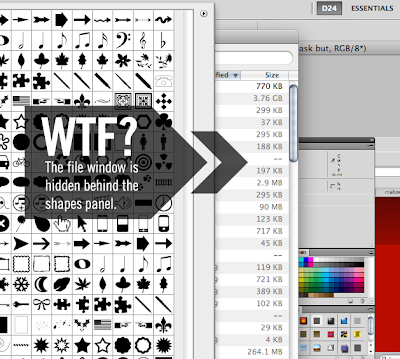
- Loading Shapes — This is a small one, but a good example of the kind of shenanigans going on with this release of CS5. I use custom vector shapes a lot. I mean, A LOT. I love them. I create my own, download them, make them out of Illustrator vectors, etc. However, when loading my custom shapes (manually) this time I ran in to a really lame bug. You see, when you open the custom shapes panel and open the "load shapes" dialog the file window appears BEHIND the shapes panel. WTF? First, this is something that was FINE in CS4. Second, how in the hell did this get past QA? I don't care if any of these things are fixed in the next maintenance release. Don't even get me started on the horrors of the Adobe Updater. It could be the single worst piece of software Adobe has ever made. I usually turn it off immediately.

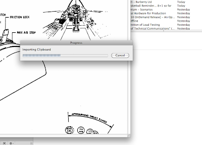
- Update! — More slowness: Importing the clipboard — For some reason, every time I do a screenshot to the clipboard and then make a new document in photoshop to past it in, I get this message:

I also get the "cool" new throbber animation that Adobe decided to use instead of the Apple watch icon on the cursor. Is this really that hard? Pasting 72dpi screenshots in to a PSD file? Is this the kind of performance that I should expect from 64-bit Adobe products?
I could go on and on. I have gone on and on. Bottom line is that Adobe is a professional engineering organization and I expect them to produce professional applications. They haven't. They have broken indispensable features that I use several times a day and introduced features that I may use once or twice. With all the press releases about new features it is extremely frustrating to have basic functionality be hindered by bad UX and bad QA.
It's easy to criticize and try to extrapolate a solution from a black box so I'm not going to try and tell you what needs to be done to make my UX better. I can tell you what it won't be. It won't be a list of bug fixes. It won't be a list of new features. Adobe needs to change the way they design their products from beginning to end. I get the sense that they don't really use their own products any more. It seems hard to believe because they seem to have such a strong design team but I have to think that this must be the truth. I don't see empathy in their UX. They don't know what I am doing with their products. Ironically, me telling them won't help. You have to experience it yourself to really know how it is to use your own products. Some of the best products were born out of someone solving their own problem. iMovie 09, Basecamp, the Deck Ad Network, these are examples of products that know what I want to do before I even do it. They don't do everything, they aren't free of errors, bugs, and UX problems, but they do what they do very well.
In the end, I know it isn't easy. I have worked for Intel, McAfee, and now Webtrends. All companies that have released some really embarrassing products. But I know it can be done once the focus is on the right things. Hopefully, the people Adobe who care just like me, can do it. If they don't I guess I'll just have to keep on buying their products and writing long winded blog posts about them. Unless someone else makes something better... ahem.


