Dec 15, 2011

Infographics and The War on Data

There are few things I hate more in the world than Fox News and Infographics. Although my dislike comes from different things, they both share a common disregard for representing data and in fact, do many things that actively work against the truths that lie in data.

Let's start with Fox News.

I'll just set aside all the misinformation and hate they spew and the entire novel one could right on how the 24  hour news cycle is ruining our society. I'll just focus on this one example featured recently on several blogs :

Read the Blog Here
Here, Fox has distorted the X-Axis of the graph to understate the drop in unemployment. Even a glance, you can see the data is just flat wrong. 9.0% is represented as the same as 8.6%. Over and above that, the visual design obscures the data behind a barrage of beveled metal.

However, if you look at the original chart from the Bureau of Labor and Statistics it isn't much better.


The drop from 9.0 to 8.6 is shown as nothing short of precipitous. 0.4% looks like free fall. That being said, the 0.4% drop is a pretty big drop for a 11 month period historically. I went back and looked at Google's view going back to 1950 and it is a "big" drop. I would argue that looking at unemployment on a yearly basis might not be the best way to evaluate the state of our economy. 

In my high school economics class, I remember reading How to Lie with Statistics. It was eye opening and has made me squint my eyes and tilt my head to the side whenever confronted by a table or chart. The principles of good data visualization outlined in that book and then further expanded upon with Tufte, Few, and McCandless have defined the way I look at design and data. With little effort one can drastically change the way data is interpreted. Whether by accident or with nefarious motives the consequences can be dire. 


That is why infographics piss me off. These ubiquitous towers of pop culture data are used for everything from the Oscars to world hunger to biking, all with equal disregard for the information they are supposedly trying to convey. I don't think anyone will disagree that infographics are the fast food of data visualization. A certain element of fun is needed to capture our attention, right? 

Of course, you could say the same should be true for every piece of data we share from a detailed report to an executive dashboard. Data should resonate with the audience and should be easily understood. It should provide insight and be compelling. I mean, a carefully placed icon or bar chart can do wonders. People just love those little spark lines too.

Infographics veer off in to the absurd when they actually inhibit access to the data. They do this in a couple ways. First, they obscure the data (info, if you will) behind "clever" graphics. Using color or icon as a visual cue is useful but when a giant Wii controller is used to point to a tiny single point of data, you're just filling space.

The opposite is also true. When the infographic is 3000 pixels tall and chocked full of 500 examples of how Facebook is taking off, you haven't edited enough and I don't know what to look at. Look, infographic designers... you're DESIGNERS. This is your job. Communication. You should be using the same principles you use in that Applebee's Fire Grilled Food brochure you're working on. You wouldn't let Mr. Applebee tell you to put every piece of flair on that thing, right? 

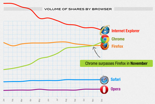
Infographics second sin is how they distort data. Just like Fox News, they make mountains out of molehills and just plain misrepresent data. Take the above example from AddThis' 2011 Social Sharing Trends infographic. It's actually one of the best examples of an infographic I have seen, so this is pretty minor on the scale of infographic atrocities. However, in this visualization they do a couple of things wrong:

  1. Lack of context—Without any context, like the overall growth per browser, this data really doesn't say anything. I'd be willing to bet that if we overlaid Chrome's user growth, we'd find that there is a strong correlation to the growth of shares. Because who is going to start using Chrome but still share via Firefox? The data is interesting but only meaningful when paired with the user growth. 
  2. Too many data points—Do we really need to show Firefox, Safari, and Opera? IE's precipitous decline and Chrome's meteoric rise are the real story. This is a brawl between the two dominant players in the space. Opera is a footnote in history and Firefox is only in the fight because of Fire Bug's dev tools. Strip the nobodies out and focus on the main event. Include Firefox, but only in that  Chrome surpassed it. 
  3. No Mobile—Speaking of browsers, where are the mobile browsers? That's a fight I want to see.
Everything else on this infographic is actually really decent. It's simple, readable, and more efficient than just simply reading the information in a paragraph. Most other infographics fail miserably in this area.

Case in point; this one is from Mashable's Top 12 Infographics of 2012 (THE TOP TWELVE!):


This little gem, all 4.9 MILLION browser crushing pixels of it, is simply trying to communicate how airlines are using social media (really going after a controversial topic) but it fails in so many ways.

  1. Huge title— If I could load this thing on a mobile device, it would be useless. On my MackBook Air, I have to scroll a whole page just to see data.
  2. Same information, 50 different ways of visualizing it—Ed Tufte would be rolling in his grave shouting "small multiples!" if he saw this. And if he were dead.
  3. Nothing Compares—No way to compare the data. I wonder how NW Airlines and Jet Blue stack up against each other? 
  4. Low quality graphics— If you're gonna make an infographic, really go for it. Don't mess around. 
  5. Waaaay too much info— FIVE THOUSAND pixels tall! You lost me at around 800px. Edit down the information just the way you would a good news article. 
I could go on and on. Really. The final criticism, and one that pretty much every infographic suffers from, is that a well written paragraph with a couple editorial images would be a hundred times more effective at conveying the data. 

Here is my challenge:

Start with the data. Edit an unformatted list of metrics down to the bare essentials. Find the correlations and interesting stuff. Then think about the story you want to tell. If graphics are needed to amplify the story, use them. But don't mess with the data. A bar chart is a great way to show comparison. It is your friend. That 3D donut chart? Not your friend.

Basically, apply design principles to information. Something you should be doing anyway. 

Oh, and make it all dynamic with HTML5. This huge JPEG thing is dumb. We can do better. 

Dec 11, 2011

The REAL Reason for the Season

As I entered Sunset Presbyterian Church this morning the sound of our music ministry filled the halls. I love this team. They rock. Seriously. Jay McKinney and his team along with the amazing production of Janet Fraser never fail to reach my heart and move me in profound ways. 

However, this morning something made me roll my eyes. O Come, O Come Emanuel. Not another Christmas service. Ugh.

This time of year the message at Sunset and churches everywhere does a hard right turn. It's the birth of our Savior! The pews are filled with visiting Grandparents and kids home from college. Suddenly, we're singing Christmas carols to a full choir and the orchestra that will be performing at the concert that night. We're hearing stories of angels and virgin births. We're sitting and watching instead of standing and worshipping. 

Yeah, I'm a real bah-humbug. I shared this opinion on the way out of church a couple Sundays ago and was glared at by anyone within earshot. My wife especially. She told me I shouldn't share this opinion with anyone else. Even her.

But I really don't like it. 

This morning I sat there in service pouting because we were sitting. I thought, "Hey May-Decemberers! Welcome to my church. We STAND during service. This ain't Wisconsin!"

I prayed for God to focus my heart. So many things can distract you from worshipping God and hearing his message. I've learned the hard way to ignore them and try to find a place to connect. But I just couldn't do it. I was completely wrapped up in my own inner dialog. 

The words of these songs just don't touch my heart. The Nativity story is wondrous. I love thinking about that time and what it must of been like. I believe it, but it just doesn't seem relevant. I feel like we're trying to PROVE it is real when faith alone is what we should rely on.

Then something profound happened in my soul. About two thirds away through I went from Negative Nancy to a man weak in the knees in worship. A favorite song started. Hillsong's Stronger melted my cold heart.  

The words, focused not on Jesus's birth but on his LIFE revealed to me why I feel so resentful this time of year. I immediately stood to my feet, surrounded by my fellow parishioners sitting on their hands. There were a few others standing and to my surprise the rest of the congregation rose to their feet and sang. The Holy Spirit moved us. 

But this isn't a post about a moment in church. This isn't a story about an Ebeneezer who doesn't get it and is shone the truth about the world. This is the story of the real reason for the season.

It actually began the day before. My good friend Ryan Russell gave me a thank you gift. I could write (and may write) an entire post about how amazing Ryan's company, Cohdoo, is and how those little things really make it an honor to work for him. The gift was Steve Jobs biography. I read a little of it that day and one quote stands out:

The juice goes out of Christianity when it becomes too based on faith rather than living like Jesus or seeing the world as Jesus saw it.

He said that religion was at it's best when it emphasized spiritual experiences rather than received dogma. I think this is what is gnawing at me this time of year.

I believe the story of Jesus's birth are true. But I do not believe they are the truth about Jesus. When I celebrate a friend's birthday, yes I am celebrating their birth. But I am really celebrating their life. When I think about Jesus and his teachings in the bible, I celebrate His life. He was an amazing teacher. Studying the Bible never ceases to produce mind blowing realizations about every facet of life.

It was important (and still is I guess) that Jesus have a birthright. He was the king of kings. Prophets and wise men had to prove he was authentic. Kind of like the ancient version of insisting someone produce a long form birth certificate. The Nativity is an important part of it.

So, for all you non-believers and May-December Christians who get dragged to church for Christmas and Easter: Your missing out.

You're also making it worse for me. You're only seeing part of the story. Sure, it's exciting and those songs are easy sing but they don't really capture what it is to be Christian. It isn't why I worship God. It isn't why I follow Jesus.

I follow him because of his life.

Update!

I wanted to thank the folks who have commented and talked with me about this post over the last few days. Especially, my wife Amy. I can't emphasize enough that last Sunday was a profound moment for me. It was a spiritual epiphany.

It left me with a new appreciation for the story of nativity and only deepened my understanding of Jesus's story. While O Come Emanuel isn't my favorite Christmas song, you'll find me listening a little closer to it next Sunday.

Thank you.

Dec 7, 2011

"Working From Home" Without the Air Quotes

The Crew

Yesterday I worked from home. No, I didn't "work from home". I flat out worked. Like a mad man. If I list out the things I accomplished it's kind of mind blowing:


  1. Combed through pages and pages of user interview notes to find tasks for a mental models exercise.
  2. Conference call with sales to iron out some SOW issues.
  3. Caulked the bathroom sink.
  4. Hung Christmas lights in the front yard.
  5. Moved the Christmas tree in the house.
  6. Spackled the ceiling.
  7. Sanded the bathroom ceiling for repainting.
  8. Cooked Mexican Crockpot Lasagna.
  9. Called the repair folks about fixing my TV.
  10. Designed a homepage feature for a freelance client.
  11. Finalized some logo elements for another.
  12. Played an hour of Call of Duty MW3.
  13. Read some email.
  14. Player with the kids.
  15. Cuddled with the kids.
All this while wrangling my 18 month old daughter and 3 year old son. Whew!

I was inspired. Maybe a little insane. But it didn't feel like a lot when I was doing it. And it makes me wonder why I don't work from home more often. I got a LOT done for Webtrends (probably more than I would if I were on site) while at the same time getting an enormous amount of home tasks done.

Why did this happen? Should everybody work from home all the time?

I don't think the answer is yes. I am glad to be back at work. But how can I get the same level of productivity at work as I did at home?

I think the answer lies in the location. Many of the things I accomplished yesterday have been on my "honey-do" list for months. My wife has attempted to walk that fine line between nagging and gently nudging (bless her) with mediocre results. I am a busy guy and it is very easy to focus on other things, especially when I'm at work.

As I sat on the couch listing mental model tasks out on my MacBook Air the house just started to speak to me. I could see that spot on the ceiling that needed spackling. I could see the tree sitting on the front porch  and the TV that needs fixing. When the kids went down for a nap I started taking care of things. And as I did one thing I would see another. When the kids woke up I couldn't ignore them so I cuddled and played before diving back in to work. When 4PM rolled around I knew I needed to get that crockpot going. Once it was in it was back to work.

The key was living and working surrounded by the things that needed to be done. Nobody told me they needed to be done, I did them because I could see them staring me in the face. 


Now let's think about work. At work we are surrounded by things that stand in the way of getting things done. Cube walls, co-workers, internet (and those tempting cat videos), managers, email, meetings... the list goes on and on. Once we wade through a pile of email we are called off to a meeting and then whoa, it's lunch time already.

It's amazing what happens when you finally get around to opening up that Photoshop file or piece of code what you see. All the sudden you are surrounded by what needs to get done. You can see how things fit together, a missing element here, an unwritten function there. Once you've dived in you start to get moving. Unfortunately, that meeting in 15 minutes or visit from a co-worker are likely to distract you.

Some people respond well to the frenetic ADD work environment. I have to admit, I love juggling projects. One single task leaves me running to Facebook or searching for distraction. However, interruptions aren't good for me either. 

At home, I defined my tasks. I didn't have a list I was checking off (lists don't do me good either) but I had the freedom to concentrate on whatever it was I wanted to and get it done. If I wanted to play Call of Duty for an hour I could. If I got in to the bathroom to sand the ceiling and saw the sink needed caulking, I could do that. I knew I needed to get that mental model project done but I could gauge how much time I needed and get back to it when I needed to.

I found myself working in 90 minute chunks. There is a lot of productivity data that points to this being an ideal cadence. Focused tasks for 90 minutes and then a break. Repeat. At most of our jobs we're expected to come in at 8AM, start working, take an hour for lunch and work until we leave at 5PM. Then we are invited to meetings and interrupted the entire time. It's no wonder productivity and motivation are many times lacking.

Of course, we aren't going to live in a world with no meetings or email or internet cats. Interruptions and distractions are a necessary part of life. However, we can do something to make interruptions work WITH our natural cadence instead of against it. I'm looking to duplicate the productivity I had yesterday at home and I think these things will help:

  1. Define my own task list. Being the master of my own internal todo list gave me the flexibility to follow the path before me. If mental models was what was in front of me I could focus on that. When I was ready to move on, I switched to something else.
  2. Focus. This is harder than it sounds. I think I was able to do it because of a couple things. First, I took care of distractions in ANTICIPATION of the focus I would need. If the kids were climbing on me, I played with them so they wouldn't be when I was trying to work. Second, I made it clear I was working. I told them (as much as you can tell an 18 month old) that I was working and gave them something else to do. This pretty much directly translates to bosses and coworkers.
  3. Flexible hours. I took a two hour lunch. I hung Christmas lights and played Call of Duty. At 4PM I got dinner prepped. I came back to my work at 7PM. It worked.
We spend so much time not doing work at work. We're expected to deliver a million things to do but are given a million distractions (sometimes even other things to do). It's time to take back the work day and get things done. 

Jun 27, 2011

This was supposed to be a comment on How Gadgets Are Ruining Cars

This started out as a simple comment on this post by Gizmodo. After a few paragraphs I decided I should just blog it:

I drive a 1964 Buick Skylark. No power windows or doors, no gps, no fuel injection or electronic ignition or air bags. Even the one luxury it does have, power steering, is not like the speed sensitive stuff you have on modern cars. It will kill you if you aren't careful.

It's a joy to drive. The sound, smell, and feel of it are like no other. I feel at home in it. It will handle well, if you know how to drive it.

Don't get me wrong, I love gadgets. And in reality, I DO drive with one. My iPhone plays the role of stereo, gps, etc. But when gadgets become the thing that defines the experience of driving, they ruin it. You're no longer designing a car for driving. You're designing it as a thing to increase productivity or listen to music in. And that is where things go wrong.

The gadgets aren't limited to the interior either. All the suspension and driveline gadgets like traction control take away from the feel of the car. They allow people to just hoon a car around a turn without care for safety of efficiency. I'll beat you in that car. I'll beat you because I don't depend on a computer to correct my turns.

I also believe people drive more unsafely in cars because of gadgets. Not because of "driving qwerty" or because their trying to do an excel spreadsheet while doing 80. No, it's because of all the safety gadgets in cars.

When I look down at my steering wheel, hard edges gleaming with chrome, I know it's gonna hurt if I get in an accident. There is no air bag. Hell, I don't even have shoulder belts. My face is gonna eat that steering wheel. But I think that makes me a safer driver.

People are driving around in super-insulated, air bag cocoons that create an illusion of safety. People take more risks, less care with the way they drive their cars. And this makes the road more dangerous for everyone else.

Mar 30, 2011

The Best Screenshots of 2010

I was cleaning out my screenshots folder (read: procrastinating) the other day and it turned out to be a fun little ride down memory lane. I don't remember why I took some of them but a few of them made me laugh. Some of them are things I found funny, others are bugs I found, and some are just random. Check them out:

Mar 9, 2011

When Technology Fails, People Die... or just get really, really angry.

Updated: We're back together. I just couldn't stay away. I tried a few runs with the Adidas MiCoach, but in the end I came back to the loving embrace of Nike+ (with Runkeeper as well).

MiCoach is very cool. Although the site is in flash, it has some very robust coaching features. Very flexible and easy to set up. However, the in-run display and app experience were lacking.

The in-run display is the focus for me. I want it to be easy to read and display the information that is most important to me. MiCoach had promise with it's minimalist style, but the contrast was just to hard to read without looking directly at the display. The "Zones" are a great idea but just too hard to target with GPS signal fluctuation and difficult to read at a glance. I have an idea for how to make it more usable but I am saving that for my own app.

The second thing about MiCoach, and something Nike+ suffers from as well, is the number of steps to simply set up a run. Runkeeper excels at this. Open the app and push the green button. That's it. Both MiCoach and Nike+ have multiple step set up procedures that are great if you are doing a certain kind of workout but suck at just quickly getting going.

I learned a lot about what I want from a running app. What I want is a clear, dead simple, in-run display and an app that knows what my goals are and makes it easy to stay on track. None of the apps out there really to those things well and most have some big issues that stand in the way.


I HATE Nike+ for iPhone.

I have logged over 620 miles in to the Nike+ web site. I have become a die hard Nike+ user. I have evangelized it to friends. I have blogged about it.

And most of all, I have looked past it's flaws to see it's beauty. It's true love. The web site is slow, flash-based, and a hodge-podge of un-focused features. But it does something for me. It motivates me. The silly little goals, trophies, and challenges keep me going. Data alone has changed me from a casual runner to a die-hard runner with marathon aspirations. Running with data is a powerful thing.

Even Tracy Morgan's exuberant voice has inspired me. But more and more, the motivational elements have  gotten old. Tracy congratulates me for things that don't matter, or are just wrong:

Tracy says, "You just ran more this week than you did last, dawg!"

"Uh, Tracy... it's Monday."

Or, "You know what? You're changing. You're changing."

"Um, thanks Tracy, but you said that to me 6 months ago and it meant a lot. After 5 times I am beginning to think you don't really mean it."

It's really sad when software is stupid. We can do better.

Now, here is the worst. I am a Green Level runner on Nike+. It's a silly distinction but it has proven to be a great motivator. Especially, as I got closer and closer to the goal of being a blue level runner. A months ago I noticed I only had 70 miles. Hmm, close. I can knock that out easily, I told myself. Last week, I only had 10 miles.

Green UI, Green Runner, only 4 miles to go!


Tuesday morning, I bounced out of bed for an early morning run after a late night (in bed at 1AM). I only had 4 miles to go and I was level Blue. I could see in my head the interface turning blue, fireworks and confetti, maybe Lance Armstrong would send me a special video message.

I kicked out my run, probably a bit faster just because of the excitement, and waited for my run to sync. But something went wrong. The run didn't sync. I tried again, still no joy. I tried again and again and again. I gave the button a little more firm of a touch, maybe I just wasn't pressing the pixels hard enough. But nothing.

I searched the forums and found people who had the same issue. I talked to a friend who said that once the run didn't sync, it never would. I was broken hearted. All that anticipation and nothing. And because of a failure to sync a run? The most basic functionality of the app? I mean, this thing goes to SPACE and tracks where I am down to meters and it can't do this?

After some angry words I got past it. I would just run again. I was going to anyway. The next afternoon I headed out again and busted out another 4.3 miles. I anxiously waited for the run to sync. Syncing, syncing, syncing... fail.


Now I had two runs not synced and still had a Green Level on Nikeplus.com. Of all the times to fail. After 84 hours, 616 miles, 75, 251 calories, and 136 runs, right before a HUGE personal milestone, now Nike+ fails. 

So, I'm done. I'm not using Nike+ again. I love it's motivation (when it's not stupid) and it's in run display but I need consistency and dependability. Along with all the other failures, like not being able to view it on my iPhone or iPad, it just isn't worth my time.

Of course, I am sure I will have issues with other apps. Luckily for me, I am a User Experience Designer and I build apps. Along with a couple of friends I am currently making a pushup app called Pushups Xtreme. It's focused on motivation and simple user experience. With those same principles, and based on the success of our first app, our next project will be a running app.

Goodbye Nike+. And stay tuned.

Feb 11, 2011

Why I don't care that Adam Scott is not on the cover over EW with the rest of the cast of Parks & Rec

Nobody reads Entertainment Weekly. Sorry, that was mean. I'm sure people do. But most people just look at the cover while waiting in line at the grocery store. And really only when Megan Fox is on the cover who, by the way, is filming a new rom-com with Adam Scott and some other dude (worked in a plug, your welcome).

For comic reference: https://twitter.com/#!/elizabethbanks/status/36174442510036992

TwitterFeed