A short but growing list of things every Dad should share with his son:
On hands in pockets:
Thumbs out, cool.
Thumbs in, itching your balls.
On bathroom exits:
Thumbs in pockets, spread. Feel loose? Your fly is down.
On talking while you pee:
Grunts are fine. Talk with friends. Never respond to, "hey, look at this." Ever.
Make your own HR bubble. Never trust anyone else's.
Never say "I love you" for the first time via text. Twitter is fine.
The only thing you should pay for with scrounged up pennies is beer.
All cars stop pretty much the same in snow and ice. Even cars with four wheel drive.
Strap it up before you slap it up.
Eat anything once. Unless it can finger paint.
Large quantities of many different beers are cool. Large quantities of one beer isn't.
Lube liberally.
Whether you know it or you don't: Google it.
Question authority but generally just ignore it.
A one stall women's bathroom = unisex.
Unisex clothing is not something you should wear.
Sweatpants are not clothes we wear in public. Or private.
Gay or straight, don't put your junk in anything you don't know.
Don't fight strangers. They could be psychotic. Fight your friends.
Never sucker punch anyone. Have the courtesy to tell them your going to hit them beforehand.
No handshakes over 3 steps. A knuckle bump, finger shake, fist pound is fine. That plus 3 more moves means you stayed up all night braiding each others hair, talking about boys and figuring thy handshake out. A simple firm handshake is more cool anyway.
On The Three Second rule:
If you see it fall on the ground and never lose eye contact with it, it could be the 5 minute rule. Eye contact is the key.
On roadside talent:
Be careful. What looks interesting from behind could be a toothless crack whore from the front. Or a dude.
On the courtesy flush:
Taking a 45 minute iPhone app powered dump? Do yourself and your fellow bathroom users a favor and flush that stink down. It's called a courtesy flush. Do it.
Dec 2, 2010
Nov 19, 2010
How many clicks?
In the UX world we often get hung up on how many clicks it takes someone to do something. A product's usability can be effectively measured by how many clicks it takes to do a task. If you reduce a task's clicks from 20 to 10, give yourself a pat on the back.
However, I think we're missing an important step. The mouse move.
We all know about the deadly triangle of interaction where a user finds themselves traversing acres of pixels to click this button, then inputting some text and then navigating to another button somewhere else on the screen. But even if you put those buttons close together, it's still probably not close enough.
This Facebook workflow for deleting a group member (see my rant on that here) underscores this thought:
This simple 2-click operation is made just a little bit harder by a slight shift of the button requiring a mouse move. It is made extremely painful when removing many (say 55) group members. No option to bulk delete is provided so you find yourself clicking, moving the mouse, then clicking again to confirm. Ugh.
So hey, now you know. Keep those clicks close. Even the simplest tasks can be made harder by small inconveniences. The only real way to prevent this kind of thing from surfacing is to REALLY use your product. I mean, really use it.
Don't just click around. Don't just run a test. Try to accomplish the task you're asking your users to do. Try to do it in 5 minutes. And don't just count clicks, count every gesture as well.
Dear Facebook,
Groups suck.
They really do. A friend of mine remarked how he liked the fact that his Facebook chat window was grouped in some manner. I thought I might like this idea too. I found the first thing in the Facebook UI and excitedly clicked it. I gleefully added 55 friends to this group. Some of these people are closer personal friends, some are just acquaintances. The common thread was that I met them at work or that they work in the same industry and the goal was that I could separate the random design stuff I find interesting from the family moments and personal stuff out. Not that they couldn't mix, but I wanted to be able to be more targeted about who I was talking to.
My group, Werk Friends, with it's comically misspelled "work" was going to simply allow me to send messages and posts to certain people. I didn't.
After setting up the group I was excited to see someone post to the group. I was a little surprised to get an email about it but I shrugged it off. I was then surprised to see a random friend comment on the post. I was also surprised, and this time a little annoyed, to get an email about the comment.
Upon receiving the third email, this time from a friend in SF who was confused and asking if the original post was something in SF, I was done.
Upon learning that every time ANYONE posted something to the group EVERYONE got an email, I was LIVID. WTF?
This isn't how groups work, Facebook. If I add something to a group, it is for my own organizational purposes. If YOU join a group, it is because you want to be in it and participate in it. Automatically sending someone an email about group posts just because someone else added them to the group is dumb.
Instead of just getting emails about posts, my friends should have gotten an email saying, "hey, do you want to be a part of Dave's group? Oh, and do you want to get an email about every frickin' post?"
This seems like a small thing, and in the end it really isn't the end of the world. But, as someone who cares about what I say to people and more importantly doesn't want to waste anyone's time, this is a major blunder.
To add insult to injury, when I went to delete the group I found out there was no "one-click" way to do it. After wandering around the UI trying to find a "delete group" button I finally visited the Facebook Help Center. I guess groups are automatically deleted if they have no members. All you have to do is delete all the members and the admin. ONE AT A TIME. So, 55 member deletes later (each requiring 2 clicks with a move of the mouse in between), my group is still there. I guess it will be deleted automatically... later?
And hopefully my friends didn't get a message saying they were deleted. Wait. They probably did, didn't they.
Faceboooook!!!!!!!!
Nov 15, 2010
Love. Run. Repeat.
This is my mantra. My motto. It came to me on my run this afternoon. A run I needed. I ran, I prayed, I got an answer.
Love. Run. Repeat.
I don't care if you believe in God. These are words to live by. They aren't a guarantee, they aren't new, easy, or a cure-all. They are the words I say to myself with each foot fall. Love. Run. Love. Run. Love...
One of the most important things as a runner is to never stop. Once you stop it is SO hard to get going again. In the short term and the long. If you're on mile 0 and you decide to take a week off or you're on mile 12 of a halfie it doesn't matter. Stopping will kill you. Keep going. Jog. 12:00 minutes a mile is better than nothing.
Same with love.
Never stop. Go all in. Stopping will kill your relationships. Even in the face of huge obstacles. What if a runner stopped every time they faced a hill? Think about how far you have come, where you want to be, the journey, and how good gliding down that hill is going to feel. The most important thing is to put one foot in front of the other and get back home.
Get back home. Never stop running. Never stop loving.
Sep 10, 2010
Updated! Nike+ GPS vs. Runkeeper: The Rundown
2 years ago, I was NOT what you'd call an avid runner. I was out of shape, overweight, and trying to get back. That is where my iPhone, Runkeeper, and the data it provides, stepped in and changed everything.
I had a Nike+ Armband but the display malfunctioned because of a manufacturing defect. I took it to the Nike Store and they gladly took it back and offered to replace it. Unfortunately, it couldn't be replaced until the new version came out. So I waited. And waited. And waited. That is where the iPhone came in.
When I got my iPhone I was disappointed that Nike didn't have an app. It was also frustrating that the Touch and Nano iPods integrated with the Nike+ system. I used iMapMyRun and searched for a good run tracking app. Runkeeper, with it's free version looked promising. I used it for a week and quickly bought the pro version. I've never looked back.
Not only is Runkeeper a great app, it's developers reach out to users to listen to ideas and troubleshoot problems. They also iterate at a feverish pace. New features added in the last few releases have made Runkeeper a robust app with well thought out user experience. The visual design has been refined as well and looks as slick as it's features. That feature list hasn't grown too much either. This is an app designed by people who use it. The Runkeeper brand and the people who are behind it are just as cool as the app itself.
But the app is just a part of the story. The data that the app presents has literally changed my life. Seriously. Seeing the miles rack up, seeing my pace go down, has revolutionized my runs. They aren't just something I have to do, but something that is an integral part of my life. I run because I love it. And I can see the result of that love on the pages of Runkeeper.com. I can also see my friends runs and friendly competition inspires improvement.
For a long time I wondered why Nike didn't just buy Runkeeper. Even more puzzling, I wondered why they didn't have their own offering. I feel like Nike, and other major running brands, just didn't think people would ever want to run with their iPhones. Talk to runners and some will tell you that they want as little resistance and weight as possible. In the end, iPhones don't way that much and you really just get used to it. Well, now Nike has introduced their gps driven running app. I can only imagine the other heavy hitters in the running category will follow suit.
I love Runkeeper CEO Jason Jacobs' response to nike's entry. He definitely has a great attitude and perspective on the business. But if he was hoping Nike would show up with a half-assed attempt, he would be kidding himself. Nike brought their A game. It's evident that runners made this app. Sure, it's overuse of wetfloor might make you think it's all flash (pun intended) but it is a well thought out app that is a serious competitor.
I'm a User Experience designer with a specialty for visual design. I look at things holistically. I'm also someone who is passionate about running and uses data for motivation. I looked at the apps from the perspective of interaction, visual design, and brand.
Interaction
One good comparison is the simple act of starting a run. Nikeplus has lots of great little touches but those get in the way when it comes to this frequent function. Once the run is started, Nikeplus does better. Runkeeper presents more information (Calorie and Average Pace) but more isn't always better. The simplified display makes it easier to read. Plus, Nikeplus has a locked mode which dials it down even more and prevents you from accidentally hitting something.
Runkeeper includes a bar chart display in addition to the map and run data. However, I discovered I didn't miss it and couldn't really think of a reason for it while running.

My favorite parts of the Nikeplus UX:
Design
This is a tricky one. iPhone design tends to gravitate to the super-glossy and both apps employ a similar level of gloss. Nike's feels lighter and more clean, highlighting the important data. The level of detail on the icons and menus really makes it a polished app.
When designing my own iPhone apps I usually try and stick with the default iOS UI elements. This leverages the user experience iPhone users are accustomed to and also ensures that you can take advantage of improvements easily later on. Runkeeper uses for the most part, styled iOS UI elements that gives it a familiar look. Nike uses their own style on everything. This can go terribly wrong, but in this case it all works and strengthens the branded experience. Most of the elements are an improvement over their Apple counterparts.
One thing that needs to go is the wet floor effect. I have nothing against it and have used it (probably too much) myself many times. It is one of the most long lived trends but it is on it's way out. This may have something to do with a larger point. The Nikeplus site.
The vibrant community on the Nikeplus site is one of the things that gives it a huge edge over it's competitors. Yet, the site itself is kind of buggy (only works in Chrome or Firefox for me and I still haven't been able to access any of the coaching), slow (mostly because of Flash), and sometimes is hard to find what you want. Mainly it's buggy. If I was on the project, I would have insisted the site get a major overhaul in time for the launch of the app. Complete with HTML5, CSS, and Web Standards with NO FLASH. iPhone and iPad compatible.*
*Weird: the Nikeplus mobile style is actually REALLY solid. Much better than the standard version.
Meanwhile, Runkeeper.com excels at navigating, data presentation, and editing runs but falls short on the community aspect. I love my street team but the challenges, sharing, and goals on the Nikeplus site seem more fleshed out and active.

Final Thoughts
I have no plans to switch to Nikeplus, especially since it is so easy to run with both apps. However, I am going to import the rest of my runs from Runkeeper (can someone make a better app for this, plz... I'm using this) and I am going to keep running with it.
I think I like Nikeplus better than Runkeeper. From the voice of the audio cues to the locked mode for the display, it's a well thought out experience. I like the Runkeeper site better for data but I like the community on Nikeplus more.
The key will be the next six months. Nikeplus.com has some serious issues. They need to be fixed. I'm also curious to see what is next. It is easy to go down a list of competitor features and check them off. I hope to see apps from Saucony, Asics, New Balance, Adidas, and other major running brands. The competition will only make the apps, including Runkeeper, that much better.
For Runkeeper, I would say keep doing what you're doing. You rock. I love the attitude. If it were me, I would ditch the Android version, EOL the Free version, and lower my price to compete. I would also focus solely on running and biking. It sounds like that is where the passion lies and focus is important now. But that's not why I wrote this post.
I wrote this post because I am passionate about running with data. It has changed my life.
I had a Nike+ Armband but the display malfunctioned because of a manufacturing defect. I took it to the Nike Store and they gladly took it back and offered to replace it. Unfortunately, it couldn't be replaced until the new version came out. So I waited. And waited. And waited. That is where the iPhone came in.
When I got my iPhone I was disappointed that Nike didn't have an app. It was also frustrating that the Touch and Nano iPods integrated with the Nike+ system. I used iMapMyRun and searched for a good run tracking app. Runkeeper, with it's free version looked promising. I used it for a week and quickly bought the pro version. I've never looked back.
Not only is Runkeeper a great app, it's developers reach out to users to listen to ideas and troubleshoot problems. They also iterate at a feverish pace. New features added in the last few releases have made Runkeeper a robust app with well thought out user experience. The visual design has been refined as well and looks as slick as it's features. That feature list hasn't grown too much either. This is an app designed by people who use it. The Runkeeper brand and the people who are behind it are just as cool as the app itself.
But the app is just a part of the story. The data that the app presents has literally changed my life. Seriously. Seeing the miles rack up, seeing my pace go down, has revolutionized my runs. They aren't just something I have to do, but something that is an integral part of my life. I run because I love it. And I can see the result of that love on the pages of Runkeeper.com. I can also see my friends runs and friendly competition inspires improvement.
For a long time I wondered why Nike didn't just buy Runkeeper. Even more puzzling, I wondered why they didn't have their own offering. I feel like Nike, and other major running brands, just didn't think people would ever want to run with their iPhones. Talk to runners and some will tell you that they want as little resistance and weight as possible. In the end, iPhones don't way that much and you really just get used to it. Well, now Nike has introduced their gps driven running app. I can only imagine the other heavy hitters in the running category will follow suit.
I love Runkeeper CEO Jason Jacobs' response to nike's entry. He definitely has a great attitude and perspective on the business. But if he was hoping Nike would show up with a half-assed attempt, he would be kidding himself. Nike brought their A game. It's evident that runners made this app. Sure, it's overuse of wetfloor might make you think it's all flash (pun intended) but it is a well thought out app that is a serious competitor.
I'm a User Experience designer with a specialty for visual design. I look at things holistically. I'm also someone who is passionate about running and uses data for motivation. I looked at the apps from the perspective of interaction, visual design, and brand.
Interaction
 |
| 1 Step vs. 4 Steps |
Runkeeper includes a bar chart display in addition to the map and run data. However, I discovered I didn't miss it and couldn't really think of a reason for it while running.

My favorite parts of the Nikeplus UX:
- Lock mode for in-run display — Simple, clean, and maybe it increases battery life?
- Display preferences — Nikeplus allows you to set the orientation of the display. I always have to flip the display so in Runkeeper because I wear my armband on the right.
- Powersong and Music — This has always been a miss for RK. The music settings don't make sense and it's easier just to use the iPod app.
- Comments and tags for runs — The little icons are easy to use, especially when sweating profusely. I do miss Runkeeper's publish to Facebook feature though.
- Calibrate my run — Sometimes GPS gets it wrong. This is an easy way to correct without editing a map.
- Improve my run — After a run, you can set a goal for besting the run you just did by speed, length of time, or distance. This would be an easy add for Runkeepers amazing training settings.
- Miles Tally — At the end of my second run, it was extremely gratifying to see the miles tick up to the total. A simple thing, but a great motivator.
My Favorite Parts of the Runkeeper UX
- On Demand Updates — In addition to voice cues at miles or timed intervals, RK will update you with a simple touch of the screen. This is great for in-run updates when you're not paying attention at the intervals.
- Interval Training — Nikeplus HAS to add this. It can take a run of the mill run and turn it in to an ass kicker.
- In-Run Photos — This sounds like gingerbread but when you see something cool, it is nice to add it to your run.
- The site — Fast and data centered. Still needs a stronger community aspect, but speed and usability go a long way.
Design
This is a tricky one. iPhone design tends to gravitate to the super-glossy and both apps employ a similar level of gloss. Nike's feels lighter and more clean, highlighting the important data. The level of detail on the icons and menus really makes it a polished app.
When designing my own iPhone apps I usually try and stick with the default iOS UI elements. This leverages the user experience iPhone users are accustomed to and also ensures that you can take advantage of improvements easily later on. Runkeeper uses for the most part, styled iOS UI elements that gives it a familiar look. Nike uses their own style on everything. This can go terribly wrong, but in this case it all works and strengthens the branded experience. Most of the elements are an improvement over their Apple counterparts.
One thing that needs to go is the wet floor effect. I have nothing against it and have used it (probably too much) myself many times. It is one of the most long lived trends but it is on it's way out. This may have something to do with a larger point. The Nikeplus site.
The vibrant community on the Nikeplus site is one of the things that gives it a huge edge over it's competitors. Yet, the site itself is kind of buggy (only works in Chrome or Firefox for me and I still haven't been able to access any of the coaching), slow (mostly because of Flash), and sometimes is hard to find what you want. Mainly it's buggy. If I was on the project, I would have insisted the site get a major overhaul in time for the launch of the app. Complete with HTML5, CSS, and Web Standards with NO FLASH. iPhone and iPad compatible.*
*Weird: the Nikeplus mobile style is actually REALLY solid. Much better than the standard version.
Meanwhile, Runkeeper.com excels at navigating, data presentation, and editing runs but falls short on the community aspect. I love my street team but the challenges, sharing, and goals on the Nikeplus site seem more fleshed out and active.

Brand
Nike's brand is it's key to success. But I'm not talking about "Just Do It", the swoosh, or Michael Jordan. I'm talking about the community of diehard Nike customers out there that are on the Nikeplus site and using this app. The tools and gear Nike makes are just the tip of the spear. They are the things we buy but what we really buy in to is the attitude. And it goes way beyond "Just Do It".
When I open the Nikeplus GPS app it says right at the top, "Give Every Run a Boost." I can press a button and play my Power Song (OK Go White Knuckles). I get encouraging messages from (what I am guessing are) famous runners and that dude from Talladega Nights. With Nikeplus, I get the collective inspiration of the Nikeplus community. And that is a powerful thing.*
*Again... slow and buggy site.
Runkeeper has a long way to go to reach Nike status but they are off to a good start. The amount of innovation they put in to every release is incredible. The response I get from tweets and email (although none lately *ahem*) let me know they are listening (again... *ahem*).
Final Thoughts
I have no plans to switch to Nikeplus, especially since it is so easy to run with both apps. However, I am going to import the rest of my runs from Runkeeper (can someone make a better app for this, plz... I'm using this) and I am going to keep running with it.
I think I like Nikeplus better than Runkeeper. From the voice of the audio cues to the locked mode for the display, it's a well thought out experience. I like the Runkeeper site better for data but I like the community on Nikeplus more.
The key will be the next six months. Nikeplus.com has some serious issues. They need to be fixed. I'm also curious to see what is next. It is easy to go down a list of competitor features and check them off. I hope to see apps from Saucony, Asics, New Balance, Adidas, and other major running brands. The competition will only make the apps, including Runkeeper, that much better.
For Runkeeper, I would say keep doing what you're doing. You rock. I love the attitude. If it were me, I would ditch the Android version, EOL the Free version, and lower my price to compete. I would also focus solely on running and biking. It sounds like that is where the passion lies and focus is important now. But that's not why I wrote this post.
I wrote this post because I am passionate about running with data. It has changed my life.
Sep 7, 2010
Two AMAZING improvements in iTunes 10 that need more hype
The Ping feature along with AirPlay and TV show rentals in iTunes 10 got a lot of hype in last week's press event. But the features I discovered this morning have me in fanboy-rapture.

Improved Syncing — It used to be that when you added a bunch of music, videos, photos, and apps to your iPad or iPhone you were likely to get some sort of message saying it couldn't be done for lack of space. This was infuriating because iTunes knows how much data you have and it knows how much space you have on your device. Why not tell me there isn't enough space BEFORE you sync? Well, iTunes 10 now does that, only better. Real-time updates on available space as you add data.
Playlist List — I might be the only one who had this issue, or the only one who was ENRAGED by it but it's like a dream come true for me. This playlist menu has bugged me for years. Scrolling was painfully slow and unusable with the scroll-wheel (or finger-scrolling?). Picking through a couple hundred playlists to fill my iPhone was excruciating. With iTunes 10 this simple menu now behaves like it should.
Great job Apple. Once again.
Improved Syncing — It used to be that when you added a bunch of music, videos, photos, and apps to your iPad or iPhone you were likely to get some sort of message saying it couldn't be done for lack of space. This was infuriating because iTunes knows how much data you have and it knows how much space you have on your device. Why not tell me there isn't enough space BEFORE you sync? Well, iTunes 10 now does that, only better. Real-time updates on available space as you add data.

Playlist List — I might be the only one who had this issue, or the only one who was ENRAGED by it but it's like a dream come true for me. This playlist menu has bugged me for years. Scrolling was painfully slow and unusable with the scroll-wheel (or finger-scrolling?). Picking through a couple hundred playlists to fill my iPhone was excruciating. With iTunes 10 this simple menu now behaves like it should.
Great job Apple. Once again.
Jul 19, 2010
Lee Iaccoca Would Be Rolling in His Grave... If He Were Dead.
My Mom sent me this email. It hailed the wisdom of Motor City's golden boy, Lee Iacocca and what he had to say about leadership in his book, Where Have All the Leaders Gone? (2007). It contained an excerpt. Here are some of the points taken from the email:
I don't agree with everything he says, but Lee Iacocca is a great man. His book, published in 2007, was a scathing review of the Bush Administration and a call to arms for leaders around the nation. This is a perversion being used to promote racist, polarizing untruths represents all that is wrong with leadership in this country.
What other lies are being spread in the name of great people like Lee Iacocca? What are you hearing on Fox News so they can sell you Cash4Gold? Open your eyes people. These aren't your leaders. Palin, Romney, Steele, McCain (sadly), Rand Paul... these are the fanatics who are rising to the top because the real leaders are waiting for a better time to run.
These are dark times for the GOP. I pray that it makes it through. We need to have all sides at the table and until the fanatics are shoved out of the limelight, we're not going to get anything done.
"Am I the only guy in this country who's fed up with what's happening? Where the h... is our outrage with this so called president? We should be screaming bloody murder!"
"I have news for the Chicago gangsters in Congress. We didn't elect you to turn this country into a losing European Socialist state. What is everybody so afraid of? That some bonehead on NBC or CNN news will call them a name? Give me a break. Why don't you guys show some spine for a change?"
"Make your own contribution by sending this to everyone you know and care about. It's our country, folks, and it's our future. Our future is at stake!!Everything quoted here is pure fiction. A simple Google search reveals the truth. I'm sure I'm not the first person to get a fake email from his Mother but I see something more sinister at work here. Who is responsible for this email? How many Moms and grandparents forwarded this bullshit to their friends and didn't have a loving son like me who angrily replied, admonishing them for falling for falsehoods?
***********************************
LET'S GET THE MUSLIM ROOKIE OUT OF THE WHITE HOUSE!!!"
I don't agree with everything he says, but Lee Iacocca is a great man. His book, published in 2007, was a scathing review of the Bush Administration and a call to arms for leaders around the nation. This is a perversion being used to promote racist, polarizing untruths represents all that is wrong with leadership in this country.
What other lies are being spread in the name of great people like Lee Iacocca? What are you hearing on Fox News so they can sell you Cash4Gold? Open your eyes people. These aren't your leaders. Palin, Romney, Steele, McCain (sadly), Rand Paul... these are the fanatics who are rising to the top because the real leaders are waiting for a better time to run.
These are dark times for the GOP. I pray that it makes it through. We need to have all sides at the table and until the fanatics are shoved out of the limelight, we're not going to get anything done.
Jun 14, 2010
New Xbox 360: Beautiful, but...

Microsoft unveiled the new Xbox 360 design today at E3. Dayumm! This new black beauty definitely got added to my WANT list. I love my Xbox and I'm currently addicted to Call of Duty Modern Warfare 2. I made the switch to Xbox a couple years ago after waiting and waiting for GT5 to come out (which as of this post, it still hasn't) and never looked back.
Xbox represents all that is cutting edge and cool at Microsoft. From the design of the UX to the thriving community of developers pumping out some of the best games in the business. The hardware is nothing less than spectacular as well. This new version of the beloved console is smaller, cooler, and cooler looking at the same price as the current model. Definitely a win.
However, as I flipped through the Flickr photo gallery I got to the last photo and was disappointed to see bare metal on the back. You can even see the the securing tabs on the USB ports. Some might say, "But Dave, you NEVER see the back. Who cares?"
To which I would reply, I see it once. That is enough. In Apple's Airport Extreme, the ports are finely crafted. I only see them once or twice but in those few moments I see the brilliance of Apple's design principles. Moreover, this is a low-level utility device for Apple, but it's flagship products get the same level of detail.
The beauty is in the details. It's how I approach every product I design. Even the most amazing visual design can be hindered and even ruined by a miss on a small detail.
May 7, 2010
Photoshop CS5 Wants Me to Drink Beer

This is probably NOT a bug, but it is weird. I was prototyping some alert concepts for Webtrends Insight and pasted some alert text in to a new alert dialog idea. Now, maybe the last font I used was a 479.1 pixel Telegraphico, but I don't remember it, certainly not at 479.1 pixels. Either way, this is what I got.
This message is quite clear. I need to drink beer. Specifically, Photoshop CS5would like me to drink an ale. Of course, you could call this a bug based on the fact that I already had a Deschutes Twilight Ale (Cask Conditioned) at lunch today. I think Photoshop CS5 should have known that.
May 6, 2010
Today's 20 minute rant: Read Right Kleen & Dry Redesign
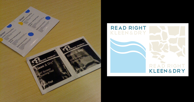
Today I cleaned a couple weeks worth of co-worker fingerprints, 2 year-old slobber, cat hair, dust, and other awesomeness off my MacBook Pro's display. Nothing like a good wipe down. But when I got to the office supply room I was surprised to see some innovation.
Now, we're making progress. As you can see in the photo, we've gone from tiny, tiny text and loads of branding to clearly labeled "wet" and "dry". Baby steps, right? But why not take an extra step and make it, like, REALLY obvious. You know? I want to be able to identify which one is wet and which one is dry from a ship off shore.
The problem with your typical screen cleaner is that somehow somebody failed to realize it is important that I know which wipe is the wet one and which wipe is the dry one. Maybe this is one of those situations where the person designing the packaging isn't actually using the product. If someone at Read Right could just go over to the package designers desk and just spit all over his or her display and just spray it. Really go for it. Then that person would have to go and wipe down their screen and read the tiny little text and finally give up and open the wrong side and spend the next 20 minutes bitching about it.
To save some time I went ahead and redesigned the packaging. It's not perfect, but a couple quick searches for "wet" and "dry" gave me some ideas for some visual cues. You're welcome.
One Shot: Wired's Tablet App FAIL
I imagine this is what @wired magazine's design team went through when they were designing the Wired tablet app. I mean, you got one of the most amazing magazines ever. It's techy, the iPad and tablets are techy. You've got compelling content that speaks to the hearts of the people who will be using these products.
You have an opportunity to reinvent the magazine and save journalism from the brink of existence. You take all the thoughts you've had about interaction and the web and technology and what it is to be a human in the greatest age of our race.
And you come up with page turning.
Nice work boys. You really did it. Douchebags.
May 4, 2010
More CS5 Ranting
I'm sure I my constant ranting about Adobe's new Creative Suite 5 release is getting old. Both my twitter followers and surrounding co-workers must be tired of hearing about the latest UX faux pas from Adobe every 5 minutes.
But here's the thing, it's really infuriating. For better or worse, my job requires me to work with Adobe's line of products. On a daily basis, I work in Photoshop, Illustrator, Fireworks, and Flash. I'm a User Experience designer, Illustrator, dabbler in ActionScript, and I actually love their products.
Because I am a User Experience Designer, I really love the details. All the big-splash, super-doo-wah, features don't mean anything if a user gets hung up on the login screen or a settings dialog. When I hear about content-aware fill or some 3D motion tool and then the panels in Photoshop extend beyond the borders of my display and I can't apply a layer mask, I get pissed.
My twitter antics have got the attention of @Adobe_Care and they asked me to elaborate on the issues I'm having. I love it when twitter allows big companies to connect with their users but I thought it would be a shame to take the discussion to a place where the whole internet couldn't see it. With that in mind, I'll try to list my top gripes with the new CS5. I use Photoshop most of the time so the feedback is centered around it. I've used Fireworks and Illustrator as well but have only found more speed and stability with them.
I'm also most frustrated with Photoshop because it was such a joy to use before the upgrade. It was like a classic sports car, polished and tuned. Now some of the most basic functions are broken. The engine is falling flat at over 4500 RPM and the door handle just fell off in my hands.
I also acknowledge that I am treading on "Demon Customer" territory. I make apps too and I know full well that sometimes it is better to ignore vocal users like me who want very specific things. However, I don't think I am "there" yet. Most of the things I have issues with are basic functionality that wasn't even a part of the new release. This is stuff that is simple, frequently used, and because of that has a huge impact on the user experience.
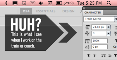
- Panels — I have a MacBook Pro and one of my favorite features of CS4 was that it "knew" when I was connected to my 24 inch display and when I was sitting on my couch watching lost and rocking some comps. Somewhere between CS4 and 5 Photoshop lost this ability. Now, after an evening of working on the couch with only the MacBook display panels flow beyond the boundary of my display.
In order to access something like the "add layer mask" button, I have to 1. Detach the panel from the panel group; 2. resize it to fit on the screen; 3. Re-attach it. Oh, and by the way, I have to do the same thing when I go back to working on the couch. Panels don't extend beyond the screen, but they appear indented from the right for some reason. Even after moving the panels back to the edge of the display, I had to do it again after closing the MacBook and opening it again later.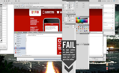
- Speed — I'm running a 3.06 MacBook Pro with a 7200RPM drive and 4 gigs of RAM. I was excited to hear that CS5 would finally bring Adobe in to the 64-bit world. Even working with really basic files, I encounter slowness with rendering text and brushes. Transforming shapes is chunky as well. This video I made shows an example of typing lag.
- Right-Clicking — This might be a bug or some setting I need to change, but I can't figure it out. I used to be able to right-click on a text object, pixel, shape, etc. and get a fly-out menu of all the layers. I could then jump to another layer without going to the layers panel. Hopefully this is just a bug.
- Window Management — Ever since Adobe introduced tabbed file windows I have had a serious beef with the implementation. As I've blogged recently, you can't drag a layer from one file to another without separating the windows or selecting "Float all in windows". This is something I do EVERY DAY. It wouldn't be so bad if you could tell Photoshop to not use tabbed file windows or if it would at least remember my choice to "Float all in windows" (BTW— who the hell wrote that UI string?).
In addition, now the windows don't seem to respect the panels. This has always been a Fireworks issue where the file window would fill the display and therefore be behind the panels. Of course, with Fireworks you could click the "+" button on the window and it would resize to fit. Photoshop's windows don't do that.
These are problems that should have been solved in this release. I would trade these for content-aware fill for this anytime.
Update! Adobe is going through this list one by one and addressing them as best they can. I am thoroughly impressed and glad to live a time where, through twitter and the interwebs, this level of transparency is possible.
It turns out there was a way to do what I wanted all along! You can use the move tool to drag a layer from the CANVAS to another tab. I was trying to drag layers from the layer panel to another tab. They say they are working on making the layer panel drag work too. It would be awesome to drag a set of layers or layer group from one tab to another. Maybe even shift-drag to keep the relative position to the upper left corner. Yes!
- Keyboard Shortcuts — This is something that is RAMPANT across all Adobe products. Rampant and inconsistent. In CS4 the slice shortcut was changed from "K" to "C". Flash uses "M" for magnify instead of "Z" for zoom. They actually changed it back this time but I still hold it against them. There are countless examples like this through out all Adobe's products. First, respect the common, accepted shortcuts across all computer applications. Second, use the same shortcuts across your own applications. Third, don't change them. I mean, they can easily be changed, but why should I have to change them to what they should be anyway.
There is a new dialog with Photoshop too. When I hit "command-H" enough times it asks me if I want to use the Mac default to hide Photoshop or use the Photoshop default to hide edges. Don't ask me. Just be consistent. This is why I have to press "shift-command-E" in Fireworks and Flash, and "command-H" in Photoshop and Illustrator. If the simple choice to be consistent was made I could still change the keyboard shortcuts to whatever I want. Instead, I have to change them so they are consistent
- Settings Import — Why do I need to open up Photoshop CS4, save my custom shapes, palettes, etc. and then import them to CS5? Why am I setting up Photoshop CS5 at all? I have owned every version of Photoshop since Photoshop 4 and used it since Photoshop 2. Along the way some new features have been introduced but the majority of the settings have stayed the same. Even the newer features haven't changed much since they were introduced. So how come Photoshop and the rest of the suite doesn't remember me? Why am I setting up my levels of undo, cursors, cache, etc again and again? Most of this stuff should be automatically ported over when I install the new version. Even if you completely overhauled vector shapes you could at least make a migration tool that or include migration in the install process.
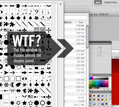
- Loading Shapes — This is a small one, but a good example of the kind of shenanigans going on with this release of CS5. I use custom vector shapes a lot. I mean, A LOT. I love them. I create my own, download them, make them out of Illustrator vectors, etc. However, when loading my custom shapes (manually) this time I ran in to a really lame bug. You see, when you open the custom shapes panel and open the "load shapes" dialog the file window appears BEHIND the shapes panel. WTF? First, this is something that was FINE in CS4. Second, how in the hell did this get past QA? I don't care if any of these things are fixed in the next maintenance release. Don't even get me started on the horrors of the Adobe Updater. It could be the single worst piece of software Adobe has ever made. I usually turn it off immediately.
- Update! — More slowness: Importing the clipboard — For some reason, every time I do a screenshot to the clipboard and then make a new document in photoshop to past it in, I get this message:
I also get the "cool" new throbber animation that Adobe decided to use instead of the Apple watch icon on the cursor. Is this really that hard? Pasting 72dpi screenshots in to a PSD file? Is this the kind of performance that I should expect from 64-bit Adobe products?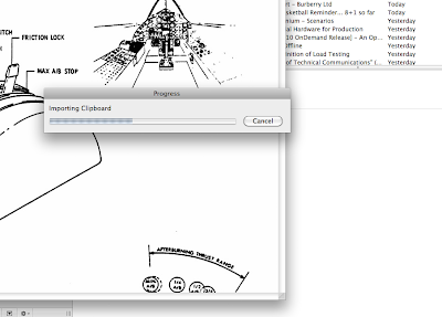


I could go on and on. I have gone on and on. Bottom line is that Adobe is a professional engineering organization and I expect them to produce professional applications. They haven't. They have broken indispensable features that I use several times a day and introduced features that I may use once or twice. With all the press releases about new features it is extremely frustrating to have basic functionality be hindered by bad UX and bad QA.
It's easy to criticize and try to extrapolate a solution from a black box so I'm not going to try and tell you what needs to be done to make my UX better. I can tell you what it won't be. It won't be a list of bug fixes. It won't be a list of new features. Adobe needs to change the way they design their products from beginning to end. I get the sense that they don't really use their own products any more. It seems hard to believe because they seem to have such a strong design team but I have to think that this must be the truth. I don't see empathy in their UX. They don't know what I am doing with their products. Ironically, me telling them won't help. You have to experience it yourself to really know how it is to use your own products. Some of the best products were born out of someone solving their own problem. iMovie 09, Basecamp, the Deck Ad Network, these are examples of products that know what I want to do before I even do it. They don't do everything, they aren't free of errors, bugs, and UX problems, but they do what they do very well.
In the end, I know it isn't easy. I have worked for Intel, McAfee, and now Webtrends. All companies that have released some really embarrassing products. But I know it can be done once the focus is on the right things. Hopefully, the people Adobe who care just like me, can do it. If they don't I guess I'll just have to keep on buying their products and writing long winded blog posts about them. Unless someone else makes something better... ahem.
Apr 30, 2010
adobe Photoshop CS5 FAIL
Ever since Adobe introduced the tabbed file window in CS4 I have had a serious problem. The tabbed file window is great in many ways but it has a fatal flaw. A flaw that I run into every fucking day.
Content-aware fill, 3D motion, applying paint effects, and moving a refs arms around might be something YOU do everyday. It's not for me. Those features are cool, but I'll use them once or twice in a long while. I use Photoshop EVERY DAY. And I am a fucking GURU. Filling in some grass with the magic wand? Kid's stuff. How about managing hundreds of comps for enterprise level web applications? Editing images is something I do, but if I had to describe my role as a designer, I would say I define BRANDS, shape products, and weave compelling stories. Photoshop is the last step in crafting amazing user experiences in print, web, video, beyond.
That is why, when you introduce a new feature like content-aware fill or you are making bulging muscles on a clay model I get kinda agro. Because every goddam day I want to do simple things to really complex files that will save me time and make my job easier and I can't because someone just didn't think something through. I mean, all I want to do is drag a layer from one file to another and I have to separate the windows in order to do that. It's a couple seconds of my day (plus another 30 spent mumbling under my breath about how Adobe engineers are douchebags) but it adds up. Don't even get me started on Fireworks.
It's the little things, boys. The little things. You can take your features and shove them up your ass until you fix the little things.
Apr 13, 2010
I'm Still Drunk... On AWESOMENESS!!
This was my first year at SWSX. It was an inspiring rush of creative energy and geek fun. Here are some highlights:
Put More Xbox in Your UX:
Josh Knowles from Gilt Groupe and many other well know projects talked about rewarding and empowering users through challenges, accolades, and the structure of rules. His example was the game of soccer, a simple game of kicking a ball around made infinitely more interesting by rules and rewards. This dovetailed nicely and emerged as a theme. From comment systems to wikis, empowering people creates deep engagement.
Technology for Results Not Profit
Bobby Gruenewald and Terry Storch run a UX team at Lifechurch.tv, a wide reaching ministry based in Austin. They created an iPhone app for the bible with 14 million downloads and 3 million active users. This was one of SXSW "Core Conversations" and there were a good number of non-profit organizations represented there.
Another theme at SXSW emerged which was sustainability and it was seen here. Not sustainability from an environmental standpoint, but from a professional standpoint. How do we, as creatives, stay engaged and passionate about what we do? Working on projects that we are passionate about creates sustainability. Nonprofits have the ability to get top talent to work on their projects. The key is to empower them and make them a part of the team, not just a gun for hire.
Another theme in the nonprofit community was the need for analytics. Nonprofits are not immune to the need for ROI. Showing results, to donors, investors, and grant-giving agencies, is becoming the standard.
Narrating the Crowd with Sanjay and Suneel Gupta
"The way we remember them, is the way we will be remembered"
The Gupta brothers told the story of the Kahanimovement.com, their storytelling project based on the work of Studs Terkel. We all have common stories. As a culture, we need them to understand where we come from and where we are going. Ordinary people have extraordinary stories. They just need to be asked to share. In this world of Twitter and Facebook and the amazing technology we take for granted, we are all storytellers.
Content in 100 Languages
This panel discussion was one of my favorites. Leonard Chien from Global Voices, June Cohen from TEDx, and Seth Binder from Mozilla represented translation on a global scale. Firefox is translated in to 96 languages with every release, TEDx is charged with conveying not only the words but the also the essence of the speakers they feature, and Global Voices is just that... global voices.
They translate it all with volunteer translators. Moreover, they have found that many of the pitfalls of professional and machine translation are avoided because of their highly motivated user translators.
Mozilla uses pairs of translators that check each other's work. It isn't a wiki but a tool developed to allow users to edit the strings in the Firefox UI. People are motivated by the need to preserve their own language and the honor or having their name on a product like Firefox or TEDx. Other rewards like conference sponsorship and cooperative competition create a driven community of translators who are committed to quality.
June from TEDx told the story of their beta release. They had seeded some of the translations with professional services. On the day of the launch they received frantic emails from their volunteers saying that some of the translations were off and in fact, were done by machine. They worked through the night and translated them correctly. For TEDx, the essence of the speech is extremely important and cannot be captured by a computer translation.
I see great potential for this to be applied at Webtrends. If we can provide tools to our users we can empower them to help us with making Webtrends products available all around the world. Not just translated, but tailored for the language and culture of the user.
Seth Binder summed it up. His vision is that when first time web users launch their browser, they get a web they can understand. Imagine using IE6 to browse the web for the first time in Bulgaria. It isn't in your language, you get a dozen pop ups, maybe a virus and a blue screen of death. You aren't coming back.
Keynote: Valerie Casey from the Designer's Accord
Valerie began her talk with a bold statement. She talked about the work that is being done by print and industrial design to solve world problems and that the interactive design community has been absent to the point of complicity. A bold statement, indeed. It made me bristle a bit and you could tell it turned off a lot of the crowd. But it was true.
Beyond "making the website for the movement" the interactive community has not yet focused our full might upon the pressing issues of our time. Many of the world's problems could be solved using technology readily available but the solution is a human one not a technological one. Visualizing the impact we have on the world and the result of our efforts to save it is something powerful we can do. Social technology of the web has the power to change behavior and to bring knowledge to those who don't have it. It's high time we used our creativity and technology to make a difference.
She also talked about a fatigue syndrome that happens with movements. When you see a movement gain momentum and mass you get the impression that "someone else is looking after it" and you disengage. The Designer's Accord is experiencing this same phenomenon.
Curating the Web
Another theme that reoccured often was "curating the web." The idea that the web is a database of millions of entries, images, words, video, etc. Curating that content is the task we have before us.
Wired Magazine's Digital Rebirth (or not)
We left this session literally pissed off. I love Wired magazine. It is one of the most insightful, well designed, and innovative magazines printed today. It is obvious that Wired's creative director, Scott Dadich doesn't know what digital means. Along with a product manager from Adobe, Scott dismissed interactive design, siting typography and the inability to do pull-quotes as the reason they chose to build their own Air app to publish Wired on tablet devices. At one point, in defense of the current crappy Wired.com site, he said that it just isn't feasible to have a full-time design team dedicated to a web site. Absurd.
In the end, there is no doubt products like the iPad will revolutionize magazines. Wired missed a chance to reinvent the magazine and instead chose to focus on realistic page turning and duplicating content from their printed magazine with animated gifs and video. However, other magazines will push the envelope and create experiences we have never imagined. It just would have been nice if Wired had done it.
My Personal Favorite: Gary Vaynerchuk
This was my favorite session Gary lit it up. His session was like no other and it should have been a keynote. He spent 10 minutes talking about some points in his book and then opened it up for the most honest and open Q & A of the conference. His honest attitude was infectious and inspiring. He didn't pull any punches. He told people they were full of shit if they were and he embraced (sometimes literally) the people who really got it.
His main point was that we all have an audience. We expect the same level of care and service from a large company, celebrity, or athlete that we do from a a friend, small business, or local official. This "Thank You Economy" is changing the way we communicate.
One of his main points was that you can't scale caring. It's not authentic. This really resonated with me and was controversial with some of the social media companies and community managers in the audience. Some people totally got it, some didn't at all.
One of the most interesting things he said, actually two things, was that, "He thinks real-time data is f***ing sexy," but he "hates analytics." I thought this dichotomy was very intriguing. He used real-time feedback and metrics to tweak his videos on uStream but saw no value whatsoever in analytics. Jim Coudal echoed this sentiment later in his session with Jon Gruber of Daringfireball.net.
I tend to agree with him. A case in point would be the nature of his session. The energy of that session, inspired by Gary's attitude, built upon itself. The effect was intoxicating and powerful. We've all been a part of something like it. Concerts, parties, games, and live events have a powerful energy that we have yet to capture on the web. Real-time data is like the roar of the crowds. It changes a one sided conversation, a glorified commercial, in to a dialog. It made me question what we are really doing here and it's a question I think we need to answer in order to really be successful.
The session closed with an impromptu Q&A Rap: http://www.youtube.com/watch?v=spbu7NV7JEw&feature=related&fmt=22
I Hugged Ze Frank
I really did. He was hanging out in front of the hall and I couldn't think of anything to say that would some up my feelings for his show and all the other amazing projects he has done on the web. So I just hugged him. I felt kind of bad afterward because he was desperately trying to remember where he knew me from. I tried to explain but I think I just made it worse.
His session was very cool. It was very interesting to find out that he had very little idea of what he was going to do next and that he wrestled with many of the same questions about creativity that we all do.
Gmail Rocks
The Gmail panel was incredible. Justin talks about it in his post as well. Empowered engineering teams drove innovation. They worked in very similar ways to us, actually which was very reaffirming. They also have the same kind of frustrating arguments that we do. The next time I am debating the difference between one text field treatment and another, I will feel better knowing that somewhere in the Valley a Googler is doing the same thing.
Parties
This is my second trip to Austin and the first during SXSW. I can't say I saw much of a difference between the two trips. There is always something going on in this town. The Gym Class Heroes at the uStream party kicked ass, the live band karaoke at the I Can Has Cheezburger party was epic, and Leo Laporte crowd surfing (while livestreaming) was amazing.
Good beer was as usual, very hard to find. It was just easier to order a Shiner than to try to explain the subtle differences between a Pale Ale and an IPA ("IP... what?" over techno never ends well). Among delicious BBQ, breakfast tacos, bacon-waffle cone taquitos, and some surprisingly good French was Frank. We ate there three times. The friendly staff, some of the most wicked and inventive sausages covered in bacon and cornmeal flapjacks, and long beer list made Frank a great spot.
The design of their signage and web site rock too! I'll be back.
Subscribe to:
Comments (Atom)