
Mar 30, 2011
The Best Screenshots of 2010
I was cleaning out my screenshots folder (read: procrastinating) the other day and it turned out to be a fun little ride down memory lane. I don't remember why I took some of them but a few of them made me laugh. Some of them are things I found funny, others are bugs I found, and some are just random. Check them out:


Mar 9, 2011
When Technology Fails, People Die... or just get really, really angry.
Updated: We're back together. I just couldn't stay away. I tried a few runs with the Adidas MiCoach, but in the end I came back to the loving embrace of Nike+ (with Runkeeper as well).
MiCoach is very cool. Although the site is in flash, it has some very robust coaching features. Very flexible and easy to set up. However, the in-run display and app experience were lacking.
The in-run display is the focus for me. I want it to be easy to read and display the information that is most important to me. MiCoach had promise with it's minimalist style, but the contrast was just to hard to read without looking directly at the display. The "Zones" are a great idea but just too hard to target with GPS signal fluctuation and difficult to read at a glance. I have an idea for how to make it more usable but I am saving that for my own app.
The second thing about MiCoach, and something Nike+ suffers from as well, is the number of steps to simply set up a run. Runkeeper excels at this. Open the app and push the green button. That's it. Both MiCoach and Nike+ have multiple step set up procedures that are great if you are doing a certain kind of workout but suck at just quickly getting going.
I learned a lot about what I want from a running app. What I want is a clear, dead simple, in-run display and an app that knows what my goals are and makes it easy to stay on track. None of the apps out there really to those things well and most have some big issues that stand in the way.
I HATE Nike+ for iPhone.
I have logged over 620 miles in to the Nike+ web site. I have become a die hard Nike+ user. I have evangelized it to friends. I have blogged about it.
And most of all, I have looked past it's flaws to see it's beauty. It's true love. The web site is slow, flash-based, and a hodge-podge of un-focused features. But it does something for me. It motivates me. The silly little goals, trophies, and challenges keep me going. Data alone has changed me from a casual runner to a die-hard runner with marathon aspirations. Running with data is a powerful thing.
Even Tracy Morgan's exuberant voice has inspired me. But more and more, the motivational elements have gotten old. Tracy congratulates me for things that don't matter, or are just wrong:
Tracy says, "You just ran more this week than you did last, dawg!"
"Uh, Tracy... it's Monday."
Or, "You know what? You're changing. You're changing."
"Um, thanks Tracy, but you said that to me 6 months ago and it meant a lot. After 5 times I am beginning to think you don't really mean it."
It's really sad when software is stupid. We can do better.
Now, here is the worst. I am a Green Level runner on Nike+. It's a silly distinction but it has proven to be a great motivator. Especially, as I got closer and closer to the goal of being a blue level runner. A months ago I noticed I only had 70 miles. Hmm, close. I can knock that out easily, I told myself. Last week, I only had 10 miles.
Tuesday morning, I bounced out of bed for an early morning run after a late night (in bed at 1AM). I only had 4 miles to go and I was level Blue. I could see in my head the interface turning blue, fireworks and confetti, maybe Lance Armstrong would send me a special video message.
I kicked out my run, probably a bit faster just because of the excitement, and waited for my run to sync. But something went wrong. The run didn't sync. I tried again, still no joy. I tried again and again and again. I gave the button a little more firm of a touch, maybe I just wasn't pressing the pixels hard enough. But nothing.
I searched the forums and found people who had the same issue. I talked to a friend who said that once the run didn't sync, it never would. I was broken hearted. All that anticipation and nothing. And because of a failure to sync a run? The most basic functionality of the app? I mean, this thing goes to SPACE and tracks where I am down to meters and it can't do this?
After some angry words I got past it. I would just run again. I was going to anyway. The next afternoon I headed out again and busted out another 4.3 miles. I anxiously waited for the run to sync. Syncing, syncing, syncing... fail.

MiCoach is very cool. Although the site is in flash, it has some very robust coaching features. Very flexible and easy to set up. However, the in-run display and app experience were lacking.
The in-run display is the focus for me. I want it to be easy to read and display the information that is most important to me. MiCoach had promise with it's minimalist style, but the contrast was just to hard to read without looking directly at the display. The "Zones" are a great idea but just too hard to target with GPS signal fluctuation and difficult to read at a glance. I have an idea for how to make it more usable but I am saving that for my own app.
The second thing about MiCoach, and something Nike+ suffers from as well, is the number of steps to simply set up a run. Runkeeper excels at this. Open the app and push the green button. That's it. Both MiCoach and Nike+ have multiple step set up procedures that are great if you are doing a certain kind of workout but suck at just quickly getting going.
I learned a lot about what I want from a running app. What I want is a clear, dead simple, in-run display and an app that knows what my goals are and makes it easy to stay on track. None of the apps out there really to those things well and most have some big issues that stand in the way.
I have logged over 620 miles in to the Nike+ web site. I have become a die hard Nike+ user. I have evangelized it to friends. I have blogged about it.
And most of all, I have looked past it's flaws to see it's beauty. It's true love. The web site is slow, flash-based, and a hodge-podge of un-focused features. But it does something for me. It motivates me. The silly little goals, trophies, and challenges keep me going. Data alone has changed me from a casual runner to a die-hard runner with marathon aspirations. Running with data is a powerful thing.
Even Tracy Morgan's exuberant voice has inspired me. But more and more, the motivational elements have gotten old. Tracy congratulates me for things that don't matter, or are just wrong:
Tracy says, "You just ran more this week than you did last, dawg!"
"Uh, Tracy... it's Monday."
Or, "You know what? You're changing. You're changing."
"Um, thanks Tracy, but you said that to me 6 months ago and it meant a lot. After 5 times I am beginning to think you don't really mean it."
It's really sad when software is stupid. We can do better.
Now, here is the worst. I am a Green Level runner on Nike+. It's a silly distinction but it has proven to be a great motivator. Especially, as I got closer and closer to the goal of being a blue level runner. A months ago I noticed I only had 70 miles. Hmm, close. I can knock that out easily, I told myself. Last week, I only had 10 miles.
 |
| Green UI, Green Runner, only 4 miles to go! |
Tuesday morning, I bounced out of bed for an early morning run after a late night (in bed at 1AM). I only had 4 miles to go and I was level Blue. I could see in my head the interface turning blue, fireworks and confetti, maybe Lance Armstrong would send me a special video message.
I kicked out my run, probably a bit faster just because of the excitement, and waited for my run to sync. But something went wrong. The run didn't sync. I tried again, still no joy. I tried again and again and again. I gave the button a little more firm of a touch, maybe I just wasn't pressing the pixels hard enough. But nothing.
I searched the forums and found people who had the same issue. I talked to a friend who said that once the run didn't sync, it never would. I was broken hearted. All that anticipation and nothing. And because of a failure to sync a run? The most basic functionality of the app? I mean, this thing goes to SPACE and tracks where I am down to meters and it can't do this?
After some angry words I got past it. I would just run again. I was going to anyway. The next afternoon I headed out again and busted out another 4.3 miles. I anxiously waited for the run to sync. Syncing, syncing, syncing... fail.

Now I had two runs not synced and still had a Green Level on Nikeplus.com. Of all the times to fail. After 84 hours, 616 miles, 75, 251 calories, and 136 runs, right before a HUGE personal milestone, now Nike+ fails.
So, I'm done. I'm not using Nike+ again. I love it's motivation (when it's not stupid) and it's in run display but I need consistency and dependability. Along with all the other failures, like not being able to view it on my iPhone or iPad, it just isn't worth my time.
Of course, I am sure I will have issues with other apps. Luckily for me, I am a User Experience Designer and I build apps. Along with a couple of friends I am currently making a pushup app called Pushups Xtreme. It's focused on motivation and simple user experience. With those same principles, and based on the success of our first app, our next project will be a running app.
Goodbye Nike+. And stay tuned.
Feb 11, 2011
Why I don't care that Adam Scott is not on the cover over EW with the rest of the cast of Parks & Rec
Nobody reads Entertainment Weekly. Sorry, that was mean. I'm sure people do. But most people just look at the cover while waiting in line at the grocery store. And really only when Megan Fox is on the cover who, by the way, is filming a new rom-com with Adam Scott and some other dude (worked in a plug, your welcome).
For comic reference: https://twitter.com/#!/elizabethbanks/status/36174442510036992
For comic reference: https://twitter.com/#!/elizabethbanks/status/36174442510036992
Dec 2, 2010
Notes for My Son
A short but growing list of things every Dad should share with his son:
On hands in pockets:
Thumbs out, cool.
Thumbs in, itching your balls.
On bathroom exits:
Thumbs in pockets, spread. Feel loose? Your fly is down.
On talking while you pee:
Grunts are fine. Talk with friends. Never respond to, "hey, look at this." Ever.
Make your own HR bubble. Never trust anyone else's.
Never say "I love you" for the first time via text. Twitter is fine.
The only thing you should pay for with scrounged up pennies is beer.
All cars stop pretty much the same in snow and ice. Even cars with four wheel drive.
Strap it up before you slap it up.
Eat anything once. Unless it can finger paint.
Large quantities of many different beers are cool. Large quantities of one beer isn't.
Lube liberally.
Whether you know it or you don't: Google it.
Question authority but generally just ignore it.
A one stall women's bathroom = unisex.
Unisex clothing is not something you should wear.
Sweatpants are not clothes we wear in public. Or private.
Gay or straight, don't put your junk in anything you don't know.
Don't fight strangers. They could be psychotic. Fight your friends.
Never sucker punch anyone. Have the courtesy to tell them your going to hit them beforehand.
No handshakes over 3 steps. A knuckle bump, finger shake, fist pound is fine. That plus 3 more moves means you stayed up all night braiding each others hair, talking about boys and figuring thy handshake out. A simple firm handshake is more cool anyway.
On The Three Second rule:
If you see it fall on the ground and never lose eye contact with it, it could be the 5 minute rule. Eye contact is the key.
On roadside talent:
Be careful. What looks interesting from behind could be a toothless crack whore from the front. Or a dude.
On the courtesy flush:
Taking a 45 minute iPhone app powered dump? Do yourself and your fellow bathroom users a favor and flush that stink down. It's called a courtesy flush. Do it.
On hands in pockets:
Thumbs out, cool.
Thumbs in, itching your balls.
On bathroom exits:
Thumbs in pockets, spread. Feel loose? Your fly is down.
On talking while you pee:
Grunts are fine. Talk with friends. Never respond to, "hey, look at this." Ever.
Make your own HR bubble. Never trust anyone else's.
Never say "I love you" for the first time via text. Twitter is fine.
The only thing you should pay for with scrounged up pennies is beer.
All cars stop pretty much the same in snow and ice. Even cars with four wheel drive.
Strap it up before you slap it up.
Eat anything once. Unless it can finger paint.
Large quantities of many different beers are cool. Large quantities of one beer isn't.
Lube liberally.
Whether you know it or you don't: Google it.
Question authority but generally just ignore it.
A one stall women's bathroom = unisex.
Unisex clothing is not something you should wear.
Sweatpants are not clothes we wear in public. Or private.
Gay or straight, don't put your junk in anything you don't know.
Don't fight strangers. They could be psychotic. Fight your friends.
Never sucker punch anyone. Have the courtesy to tell them your going to hit them beforehand.
No handshakes over 3 steps. A knuckle bump, finger shake, fist pound is fine. That plus 3 more moves means you stayed up all night braiding each others hair, talking about boys and figuring thy handshake out. A simple firm handshake is more cool anyway.
On The Three Second rule:
If you see it fall on the ground and never lose eye contact with it, it could be the 5 minute rule. Eye contact is the key.
On roadside talent:
Be careful. What looks interesting from behind could be a toothless crack whore from the front. Or a dude.
On the courtesy flush:
Taking a 45 minute iPhone app powered dump? Do yourself and your fellow bathroom users a favor and flush that stink down. It's called a courtesy flush. Do it.
Nov 19, 2010
How many clicks?
In the UX world we often get hung up on how many clicks it takes someone to do something. A product's usability can be effectively measured by how many clicks it takes to do a task. If you reduce a task's clicks from 20 to 10, give yourself a pat on the back.
However, I think we're missing an important step. The mouse move.
We all know about the deadly triangle of interaction where a user finds themselves traversing acres of pixels to click this button, then inputting some text and then navigating to another button somewhere else on the screen. But even if you put those buttons close together, it's still probably not close enough.
This Facebook workflow for deleting a group member (see my rant on that here) underscores this thought:
This simple 2-click operation is made just a little bit harder by a slight shift of the button requiring a mouse move. It is made extremely painful when removing many (say 55) group members. No option to bulk delete is provided so you find yourself clicking, moving the mouse, then clicking again to confirm. Ugh.
So hey, now you know. Keep those clicks close. Even the simplest tasks can be made harder by small inconveniences. The only real way to prevent this kind of thing from surfacing is to REALLY use your product. I mean, really use it.
Don't just click around. Don't just run a test. Try to accomplish the task you're asking your users to do. Try to do it in 5 minutes. And don't just count clicks, count every gesture as well.
However, I think we're missing an important step. The mouse move.
We all know about the deadly triangle of interaction where a user finds themselves traversing acres of pixels to click this button, then inputting some text and then navigating to another button somewhere else on the screen. But even if you put those buttons close together, it's still probably not close enough.
This Facebook workflow for deleting a group member (see my rant on that here) underscores this thought:
This simple 2-click operation is made just a little bit harder by a slight shift of the button requiring a mouse move. It is made extremely painful when removing many (say 55) group members. No option to bulk delete is provided so you find yourself clicking, moving the mouse, then clicking again to confirm. Ugh.
So hey, now you know. Keep those clicks close. Even the simplest tasks can be made harder by small inconveniences. The only real way to prevent this kind of thing from surfacing is to REALLY use your product. I mean, really use it.
Don't just click around. Don't just run a test. Try to accomplish the task you're asking your users to do. Try to do it in 5 minutes. And don't just count clicks, count every gesture as well.
Dear Facebook,
Groups suck.
They really do. A friend of mine remarked how he liked the fact that his Facebook chat window was grouped in some manner. I thought I might like this idea too. I found the first thing in the Facebook UI and excitedly clicked it. I gleefully added 55 friends to this group. Some of these people are closer personal friends, some are just acquaintances. The common thread was that I met them at work or that they work in the same industry and the goal was that I could separate the random design stuff I find interesting from the family moments and personal stuff out. Not that they couldn't mix, but I wanted to be able to be more targeted about who I was talking to.
My group, Werk Friends, with it's comically misspelled "work" was going to simply allow me to send messages and posts to certain people. I didn't.
After setting up the group I was excited to see someone post to the group. I was a little surprised to get an email about it but I shrugged it off. I was then surprised to see a random friend comment on the post. I was also surprised, and this time a little annoyed, to get an email about the comment.
Upon receiving the third email, this time from a friend in SF who was confused and asking if the original post was something in SF, I was done.
Upon learning that every time ANYONE posted something to the group EVERYONE got an email, I was LIVID. WTF?
This isn't how groups work, Facebook. If I add something to a group, it is for my own organizational purposes. If YOU join a group, it is because you want to be in it and participate in it. Automatically sending someone an email about group posts just because someone else added them to the group is dumb.
Instead of just getting emails about posts, my friends should have gotten an email saying, "hey, do you want to be a part of Dave's group? Oh, and do you want to get an email about every frickin' post?"
This seems like a small thing, and in the end it really isn't the end of the world. But, as someone who cares about what I say to people and more importantly doesn't want to waste anyone's time, this is a major blunder.
To add insult to injury, when I went to delete the group I found out there was no "one-click" way to do it. After wandering around the UI trying to find a "delete group" button I finally visited the Facebook Help Center. I guess groups are automatically deleted if they have no members. All you have to do is delete all the members and the admin. ONE AT A TIME. So, 55 member deletes later (each requiring 2 clicks with a move of the mouse in between), my group is still there. I guess it will be deleted automatically... later?
And hopefully my friends didn't get a message saying they were deleted. Wait. They probably did, didn't they.
Faceboooook!!!!!!!!
They really do. A friend of mine remarked how he liked the fact that his Facebook chat window was grouped in some manner. I thought I might like this idea too. I found the first thing in the Facebook UI and excitedly clicked it. I gleefully added 55 friends to this group. Some of these people are closer personal friends, some are just acquaintances. The common thread was that I met them at work or that they work in the same industry and the goal was that I could separate the random design stuff I find interesting from the family moments and personal stuff out. Not that they couldn't mix, but I wanted to be able to be more targeted about who I was talking to.
My group, Werk Friends, with it's comically misspelled "work" was going to simply allow me to send messages and posts to certain people. I didn't.
After setting up the group I was excited to see someone post to the group. I was a little surprised to get an email about it but I shrugged it off. I was then surprised to see a random friend comment on the post. I was also surprised, and this time a little annoyed, to get an email about the comment.
Upon receiving the third email, this time from a friend in SF who was confused and asking if the original post was something in SF, I was done.
Upon learning that every time ANYONE posted something to the group EVERYONE got an email, I was LIVID. WTF?
This isn't how groups work, Facebook. If I add something to a group, it is for my own organizational purposes. If YOU join a group, it is because you want to be in it and participate in it. Automatically sending someone an email about group posts just because someone else added them to the group is dumb.
Instead of just getting emails about posts, my friends should have gotten an email saying, "hey, do you want to be a part of Dave's group? Oh, and do you want to get an email about every frickin' post?"
This seems like a small thing, and in the end it really isn't the end of the world. But, as someone who cares about what I say to people and more importantly doesn't want to waste anyone's time, this is a major blunder.
To add insult to injury, when I went to delete the group I found out there was no "one-click" way to do it. After wandering around the UI trying to find a "delete group" button I finally visited the Facebook Help Center. I guess groups are automatically deleted if they have no members. All you have to do is delete all the members and the admin. ONE AT A TIME. So, 55 member deletes later (each requiring 2 clicks with a move of the mouse in between), my group is still there. I guess it will be deleted automatically... later?
And hopefully my friends didn't get a message saying they were deleted. Wait. They probably did, didn't they.
Faceboooook!!!!!!!!
Nov 15, 2010
Love. Run. Repeat.
This is my mantra. My motto. It came to me on my run this afternoon. A run I needed. I ran, I prayed, I got an answer.
Love. Run. Repeat.
I don't care if you believe in God. These are words to live by. They aren't a guarantee, they aren't new, easy, or a cure-all. They are the words I say to myself with each foot fall. Love. Run. Love. Run. Love...
One of the most important things as a runner is to never stop. Once you stop it is SO hard to get going again. In the short term and the long. If you're on mile 0 and you decide to take a week off or you're on mile 12 of a halfie it doesn't matter. Stopping will kill you. Keep going. Jog. 12:00 minutes a mile is better than nothing.
Same with love.
Never stop. Go all in. Stopping will kill your relationships. Even in the face of huge obstacles. What if a runner stopped every time they faced a hill? Think about how far you have come, where you want to be, the journey, and how good gliding down that hill is going to feel. The most important thing is to put one foot in front of the other and get back home.
Get back home. Never stop running. Never stop loving.
Love. Run. Repeat.
I don't care if you believe in God. These are words to live by. They aren't a guarantee, they aren't new, easy, or a cure-all. They are the words I say to myself with each foot fall. Love. Run. Love. Run. Love...
One of the most important things as a runner is to never stop. Once you stop it is SO hard to get going again. In the short term and the long. If you're on mile 0 and you decide to take a week off or you're on mile 12 of a halfie it doesn't matter. Stopping will kill you. Keep going. Jog. 12:00 minutes a mile is better than nothing.
Same with love.
Never stop. Go all in. Stopping will kill your relationships. Even in the face of huge obstacles. What if a runner stopped every time they faced a hill? Think about how far you have come, where you want to be, the journey, and how good gliding down that hill is going to feel. The most important thing is to put one foot in front of the other and get back home.
Get back home. Never stop running. Never stop loving.
Sep 10, 2010
Updated! Nike+ GPS vs. Runkeeper: The Rundown
2 years ago, I was NOT what you'd call an avid runner. I was out of shape, overweight, and trying to get back. That is where my iPhone, Runkeeper, and the data it provides, stepped in and changed everything.
I had a Nike+ Armband but the display malfunctioned because of a manufacturing defect. I took it to the Nike Store and they gladly took it back and offered to replace it. Unfortunately, it couldn't be replaced until the new version came out. So I waited. And waited. And waited. That is where the iPhone came in.
When I got my iPhone I was disappointed that Nike didn't have an app. It was also frustrating that the Touch and Nano iPods integrated with the Nike+ system. I used iMapMyRun and searched for a good run tracking app. Runkeeper, with it's free version looked promising. I used it for a week and quickly bought the pro version. I've never looked back.
Not only is Runkeeper a great app, it's developers reach out to users to listen to ideas and troubleshoot problems. They also iterate at a feverish pace. New features added in the last few releases have made Runkeeper a robust app with well thought out user experience. The visual design has been refined as well and looks as slick as it's features. That feature list hasn't grown too much either. This is an app designed by people who use it. The Runkeeper brand and the people who are behind it are just as cool as the app itself.
But the app is just a part of the story. The data that the app presents has literally changed my life. Seriously. Seeing the miles rack up, seeing my pace go down, has revolutionized my runs. They aren't just something I have to do, but something that is an integral part of my life. I run because I love it. And I can see the result of that love on the pages of Runkeeper.com. I can also see my friends runs and friendly competition inspires improvement.
For a long time I wondered why Nike didn't just buy Runkeeper. Even more puzzling, I wondered why they didn't have their own offering. I feel like Nike, and other major running brands, just didn't think people would ever want to run with their iPhones. Talk to runners and some will tell you that they want as little resistance and weight as possible. In the end, iPhones don't way that much and you really just get used to it. Well, now Nike has introduced their gps driven running app. I can only imagine the other heavy hitters in the running category will follow suit.
I love Runkeeper CEO Jason Jacobs' response to nike's entry. He definitely has a great attitude and perspective on the business. But if he was hoping Nike would show up with a half-assed attempt, he would be kidding himself. Nike brought their A game. It's evident that runners made this app. Sure, it's overuse of wetfloor might make you think it's all flash (pun intended) but it is a well thought out app that is a serious competitor.
I'm a User Experience designer with a specialty for visual design. I look at things holistically. I'm also someone who is passionate about running and uses data for motivation. I looked at the apps from the perspective of interaction, visual design, and brand.
Interaction
One good comparison is the simple act of starting a run. Nikeplus has lots of great little touches but those get in the way when it comes to this frequent function. Once the run is started, Nikeplus does better. Runkeeper presents more information (Calorie and Average Pace) but more isn't always better. The simplified display makes it easier to read. Plus, Nikeplus has a locked mode which dials it down even more and prevents you from accidentally hitting something.
Runkeeper includes a bar chart display in addition to the map and run data. However, I discovered I didn't miss it and couldn't really think of a reason for it while running.

My favorite parts of the Nikeplus UX:
Design
This is a tricky one. iPhone design tends to gravitate to the super-glossy and both apps employ a similar level of gloss. Nike's feels lighter and more clean, highlighting the important data. The level of detail on the icons and menus really makes it a polished app.
When designing my own iPhone apps I usually try and stick with the default iOS UI elements. This leverages the user experience iPhone users are accustomed to and also ensures that you can take advantage of improvements easily later on. Runkeeper uses for the most part, styled iOS UI elements that gives it a familiar look. Nike uses their own style on everything. This can go terribly wrong, but in this case it all works and strengthens the branded experience. Most of the elements are an improvement over their Apple counterparts.
One thing that needs to go is the wet floor effect. I have nothing against it and have used it (probably too much) myself many times. It is one of the most long lived trends but it is on it's way out. This may have something to do with a larger point. The Nikeplus site.
The vibrant community on the Nikeplus site is one of the things that gives it a huge edge over it's competitors. Yet, the site itself is kind of buggy (only works in Chrome or Firefox for me and I still haven't been able to access any of the coaching), slow (mostly because of Flash), and sometimes is hard to find what you want. Mainly it's buggy. If I was on the project, I would have insisted the site get a major overhaul in time for the launch of the app. Complete with HTML5, CSS, and Web Standards with NO FLASH. iPhone and iPad compatible.*
*Weird: the Nikeplus mobile style is actually REALLY solid. Much better than the standard version.
Meanwhile, Runkeeper.com excels at navigating, data presentation, and editing runs but falls short on the community aspect. I love my street team but the challenges, sharing, and goals on the Nikeplus site seem more fleshed out and active.

Final Thoughts
I have no plans to switch to Nikeplus, especially since it is so easy to run with both apps. However, I am going to import the rest of my runs from Runkeeper (can someone make a better app for this, plz... I'm using this) and I am going to keep running with it.
I think I like Nikeplus better than Runkeeper. From the voice of the audio cues to the locked mode for the display, it's a well thought out experience. I like the Runkeeper site better for data but I like the community on Nikeplus more.
The key will be the next six months. Nikeplus.com has some serious issues. They need to be fixed. I'm also curious to see what is next. It is easy to go down a list of competitor features and check them off. I hope to see apps from Saucony, Asics, New Balance, Adidas, and other major running brands. The competition will only make the apps, including Runkeeper, that much better.
For Runkeeper, I would say keep doing what you're doing. You rock. I love the attitude. If it were me, I would ditch the Android version, EOL the Free version, and lower my price to compete. I would also focus solely on running and biking. It sounds like that is where the passion lies and focus is important now. But that's not why I wrote this post.
I wrote this post because I am passionate about running with data. It has changed my life.
I had a Nike+ Armband but the display malfunctioned because of a manufacturing defect. I took it to the Nike Store and they gladly took it back and offered to replace it. Unfortunately, it couldn't be replaced until the new version came out. So I waited. And waited. And waited. That is where the iPhone came in.
When I got my iPhone I was disappointed that Nike didn't have an app. It was also frustrating that the Touch and Nano iPods integrated with the Nike+ system. I used iMapMyRun and searched for a good run tracking app. Runkeeper, with it's free version looked promising. I used it for a week and quickly bought the pro version. I've never looked back.
Not only is Runkeeper a great app, it's developers reach out to users to listen to ideas and troubleshoot problems. They also iterate at a feverish pace. New features added in the last few releases have made Runkeeper a robust app with well thought out user experience. The visual design has been refined as well and looks as slick as it's features. That feature list hasn't grown too much either. This is an app designed by people who use it. The Runkeeper brand and the people who are behind it are just as cool as the app itself.
But the app is just a part of the story. The data that the app presents has literally changed my life. Seriously. Seeing the miles rack up, seeing my pace go down, has revolutionized my runs. They aren't just something I have to do, but something that is an integral part of my life. I run because I love it. And I can see the result of that love on the pages of Runkeeper.com. I can also see my friends runs and friendly competition inspires improvement.
For a long time I wondered why Nike didn't just buy Runkeeper. Even more puzzling, I wondered why they didn't have their own offering. I feel like Nike, and other major running brands, just didn't think people would ever want to run with their iPhones. Talk to runners and some will tell you that they want as little resistance and weight as possible. In the end, iPhones don't way that much and you really just get used to it. Well, now Nike has introduced their gps driven running app. I can only imagine the other heavy hitters in the running category will follow suit.
I love Runkeeper CEO Jason Jacobs' response to nike's entry. He definitely has a great attitude and perspective on the business. But if he was hoping Nike would show up with a half-assed attempt, he would be kidding himself. Nike brought their A game. It's evident that runners made this app. Sure, it's overuse of wetfloor might make you think it's all flash (pun intended) but it is a well thought out app that is a serious competitor.
I'm a User Experience designer with a specialty for visual design. I look at things holistically. I'm also someone who is passionate about running and uses data for motivation. I looked at the apps from the perspective of interaction, visual design, and brand.
Interaction
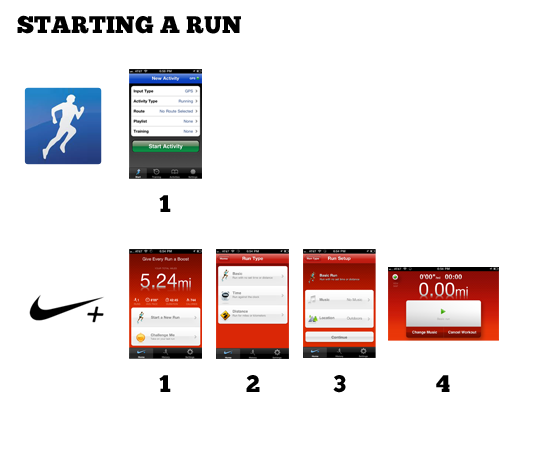 |
| 1 Step vs. 4 Steps |
Runkeeper includes a bar chart display in addition to the map and run data. However, I discovered I didn't miss it and couldn't really think of a reason for it while running.

My favorite parts of the Nikeplus UX:
- Lock mode for in-run display — Simple, clean, and maybe it increases battery life?
- Display preferences — Nikeplus allows you to set the orientation of the display. I always have to flip the display so in Runkeeper because I wear my armband on the right.
- Powersong and Music — This has always been a miss for RK. The music settings don't make sense and it's easier just to use the iPod app.
- Comments and tags for runs — The little icons are easy to use, especially when sweating profusely. I do miss Runkeeper's publish to Facebook feature though.
- Calibrate my run — Sometimes GPS gets it wrong. This is an easy way to correct without editing a map.
- Improve my run — After a run, you can set a goal for besting the run you just did by speed, length of time, or distance. This would be an easy add for Runkeepers amazing training settings.
- Miles Tally — At the end of my second run, it was extremely gratifying to see the miles tick up to the total. A simple thing, but a great motivator.
My Favorite Parts of the Runkeeper UX
- On Demand Updates — In addition to voice cues at miles or timed intervals, RK will update you with a simple touch of the screen. This is great for in-run updates when you're not paying attention at the intervals.
- Interval Training — Nikeplus HAS to add this. It can take a run of the mill run and turn it in to an ass kicker.
- In-Run Photos — This sounds like gingerbread but when you see something cool, it is nice to add it to your run.
- The site — Fast and data centered. Still needs a stronger community aspect, but speed and usability go a long way.
Design
This is a tricky one. iPhone design tends to gravitate to the super-glossy and both apps employ a similar level of gloss. Nike's feels lighter and more clean, highlighting the important data. The level of detail on the icons and menus really makes it a polished app.
When designing my own iPhone apps I usually try and stick with the default iOS UI elements. This leverages the user experience iPhone users are accustomed to and also ensures that you can take advantage of improvements easily later on. Runkeeper uses for the most part, styled iOS UI elements that gives it a familiar look. Nike uses their own style on everything. This can go terribly wrong, but in this case it all works and strengthens the branded experience. Most of the elements are an improvement over their Apple counterparts.
One thing that needs to go is the wet floor effect. I have nothing against it and have used it (probably too much) myself many times. It is one of the most long lived trends but it is on it's way out. This may have something to do with a larger point. The Nikeplus site.
The vibrant community on the Nikeplus site is one of the things that gives it a huge edge over it's competitors. Yet, the site itself is kind of buggy (only works in Chrome or Firefox for me and I still haven't been able to access any of the coaching), slow (mostly because of Flash), and sometimes is hard to find what you want. Mainly it's buggy. If I was on the project, I would have insisted the site get a major overhaul in time for the launch of the app. Complete with HTML5, CSS, and Web Standards with NO FLASH. iPhone and iPad compatible.*
*Weird: the Nikeplus mobile style is actually REALLY solid. Much better than the standard version.
Meanwhile, Runkeeper.com excels at navigating, data presentation, and editing runs but falls short on the community aspect. I love my street team but the challenges, sharing, and goals on the Nikeplus site seem more fleshed out and active.

Brand
Nike's brand is it's key to success. But I'm not talking about "Just Do It", the swoosh, or Michael Jordan. I'm talking about the community of diehard Nike customers out there that are on the Nikeplus site and using this app. The tools and gear Nike makes are just the tip of the spear. They are the things we buy but what we really buy in to is the attitude. And it goes way beyond "Just Do It".
When I open the Nikeplus GPS app it says right at the top, "Give Every Run a Boost." I can press a button and play my Power Song (OK Go White Knuckles). I get encouraging messages from (what I am guessing are) famous runners and that dude from Talladega Nights. With Nikeplus, I get the collective inspiration of the Nikeplus community. And that is a powerful thing.*
*Again... slow and buggy site.
Runkeeper has a long way to go to reach Nike status but they are off to a good start. The amount of innovation they put in to every release is incredible. The response I get from tweets and email (although none lately *ahem*) let me know they are listening (again... *ahem*).
Final Thoughts
I have no plans to switch to Nikeplus, especially since it is so easy to run with both apps. However, I am going to import the rest of my runs from Runkeeper (can someone make a better app for this, plz... I'm using this) and I am going to keep running with it.
I think I like Nikeplus better than Runkeeper. From the voice of the audio cues to the locked mode for the display, it's a well thought out experience. I like the Runkeeper site better for data but I like the community on Nikeplus more.
The key will be the next six months. Nikeplus.com has some serious issues. They need to be fixed. I'm also curious to see what is next. It is easy to go down a list of competitor features and check them off. I hope to see apps from Saucony, Asics, New Balance, Adidas, and other major running brands. The competition will only make the apps, including Runkeeper, that much better.
For Runkeeper, I would say keep doing what you're doing. You rock. I love the attitude. If it were me, I would ditch the Android version, EOL the Free version, and lower my price to compete. I would also focus solely on running and biking. It sounds like that is where the passion lies and focus is important now. But that's not why I wrote this post.
I wrote this post because I am passionate about running with data. It has changed my life.
Sep 7, 2010
Two AMAZING improvements in iTunes 10 that need more hype
The Ping feature along with AirPlay and TV show rentals in iTunes 10 got a lot of hype in last week's press event. But the features I discovered this morning have me in fanboy-rapture.

Improved Syncing — It used to be that when you added a bunch of music, videos, photos, and apps to your iPad or iPhone you were likely to get some sort of message saying it couldn't be done for lack of space. This was infuriating because iTunes knows how much data you have and it knows how much space you have on your device. Why not tell me there isn't enough space BEFORE you sync? Well, iTunes 10 now does that, only better. Real-time updates on available space as you add data.
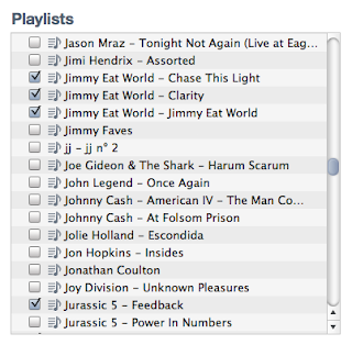
Playlist List — I might be the only one who had this issue, or the only one who was ENRAGED by it but it's like a dream come true for me. This playlist menu has bugged me for years. Scrolling was painfully slow and unusable with the scroll-wheel (or finger-scrolling?). Picking through a couple hundred playlists to fill my iPhone was excruciating. With iTunes 10 this simple menu now behaves like it should.
Great job Apple. Once again.

Improved Syncing — It used to be that when you added a bunch of music, videos, photos, and apps to your iPad or iPhone you were likely to get some sort of message saying it couldn't be done for lack of space. This was infuriating because iTunes knows how much data you have and it knows how much space you have on your device. Why not tell me there isn't enough space BEFORE you sync? Well, iTunes 10 now does that, only better. Real-time updates on available space as you add data.

Playlist List — I might be the only one who had this issue, or the only one who was ENRAGED by it but it's like a dream come true for me. This playlist menu has bugged me for years. Scrolling was painfully slow and unusable with the scroll-wheel (or finger-scrolling?). Picking through a couple hundred playlists to fill my iPhone was excruciating. With iTunes 10 this simple menu now behaves like it should.
Great job Apple. Once again.
Jul 19, 2010
Lee Iaccoca Would Be Rolling in His Grave... If He Were Dead.
My Mom sent me this email. It hailed the wisdom of Motor City's golden boy, Lee Iacocca and what he had to say about leadership in his book, Where Have All the Leaders Gone? (2007). It contained an excerpt. Here are some of the points taken from the email:
I don't agree with everything he says, but Lee Iacocca is a great man. His book, published in 2007, was a scathing review of the Bush Administration and a call to arms for leaders around the nation. This is a perversion being used to promote racist, polarizing untruths represents all that is wrong with leadership in this country.
What other lies are being spread in the name of great people like Lee Iacocca? What are you hearing on Fox News so they can sell you Cash4Gold? Open your eyes people. These aren't your leaders. Palin, Romney, Steele, McCain (sadly), Rand Paul... these are the fanatics who are rising to the top because the real leaders are waiting for a better time to run.
These are dark times for the GOP. I pray that it makes it through. We need to have all sides at the table and until the fanatics are shoved out of the limelight, we're not going to get anything done.
"Am I the only guy in this country who's fed up with what's happening? Where the h... is our outrage with this so called president? We should be screaming bloody murder!"
"I have news for the Chicago gangsters in Congress. We didn't elect you to turn this country into a losing European Socialist state. What is everybody so afraid of? That some bonehead on NBC or CNN news will call them a name? Give me a break. Why don't you guys show some spine for a change?"
"Make your own contribution by sending this to everyone you know and care about. It's our country, folks, and it's our future. Our future is at stake!!Everything quoted here is pure fiction. A simple Google search reveals the truth. I'm sure I'm not the first person to get a fake email from his Mother but I see something more sinister at work here. Who is responsible for this email? How many Moms and grandparents forwarded this bullshit to their friends and didn't have a loving son like me who angrily replied, admonishing them for falling for falsehoods?
***********************************
LET'S GET THE MUSLIM ROOKIE OUT OF THE WHITE HOUSE!!!"
I don't agree with everything he says, but Lee Iacocca is a great man. His book, published in 2007, was a scathing review of the Bush Administration and a call to arms for leaders around the nation. This is a perversion being used to promote racist, polarizing untruths represents all that is wrong with leadership in this country.
What other lies are being spread in the name of great people like Lee Iacocca? What are you hearing on Fox News so they can sell you Cash4Gold? Open your eyes people. These aren't your leaders. Palin, Romney, Steele, McCain (sadly), Rand Paul... these are the fanatics who are rising to the top because the real leaders are waiting for a better time to run.
These are dark times for the GOP. I pray that it makes it through. We need to have all sides at the table and until the fanatics are shoved out of the limelight, we're not going to get anything done.
Subscribe to:
Posts (Atom)